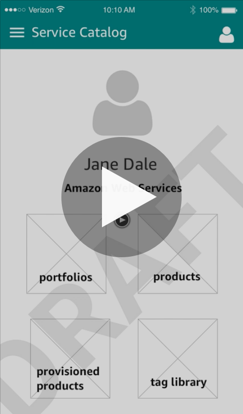
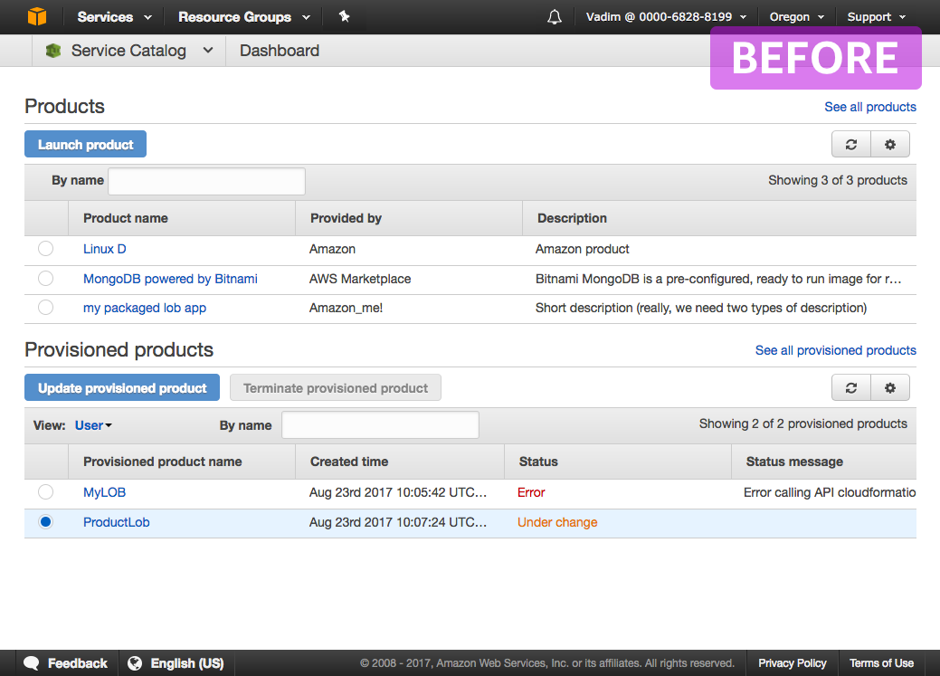
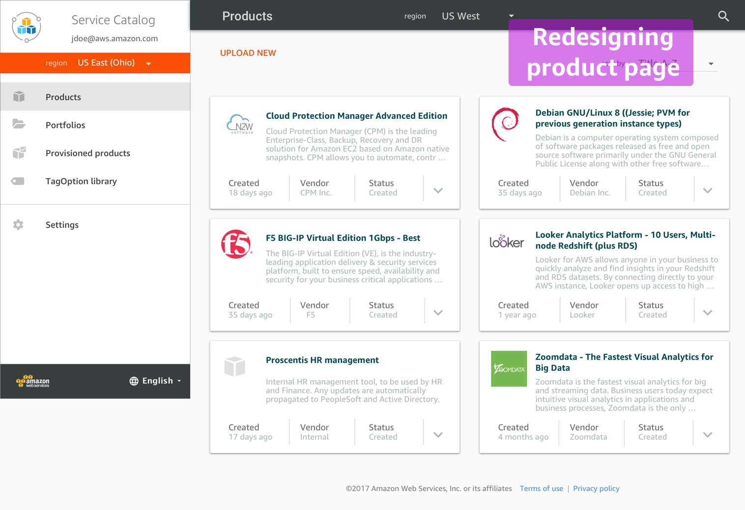
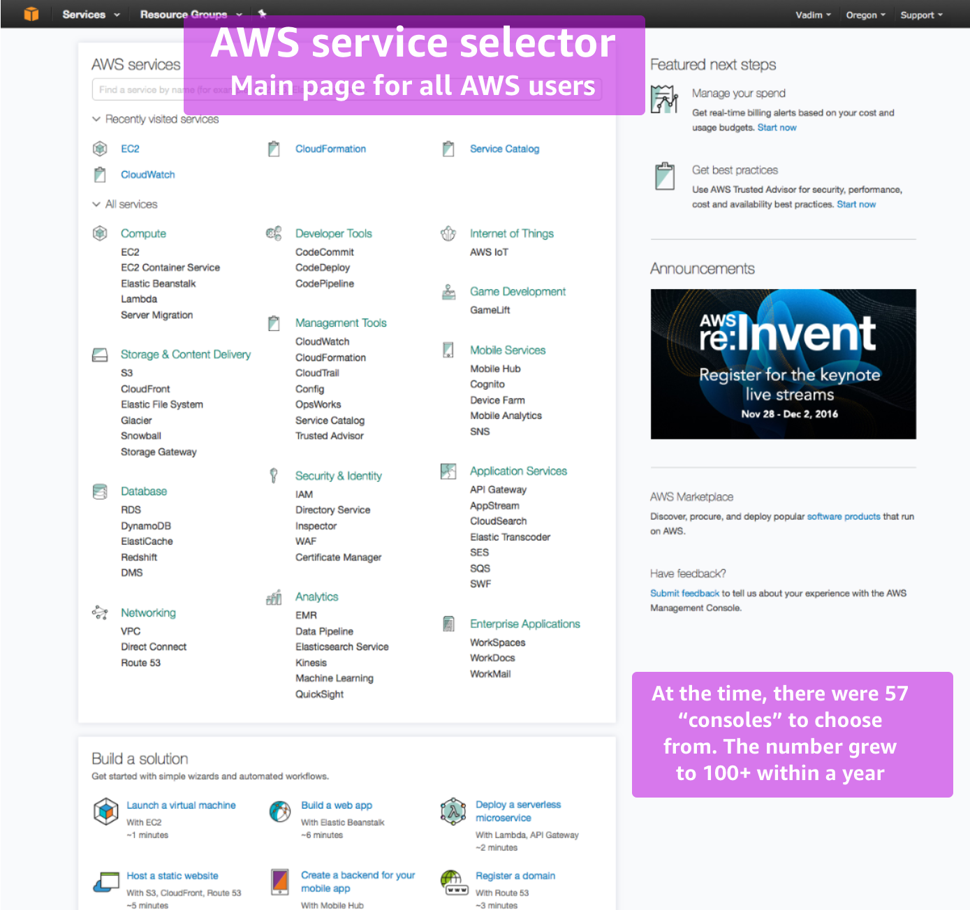
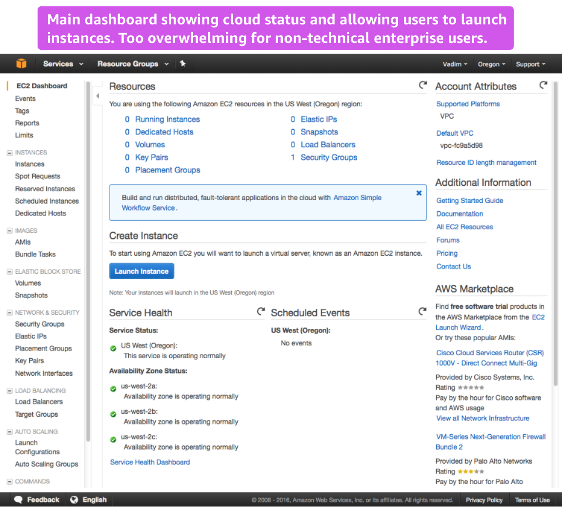
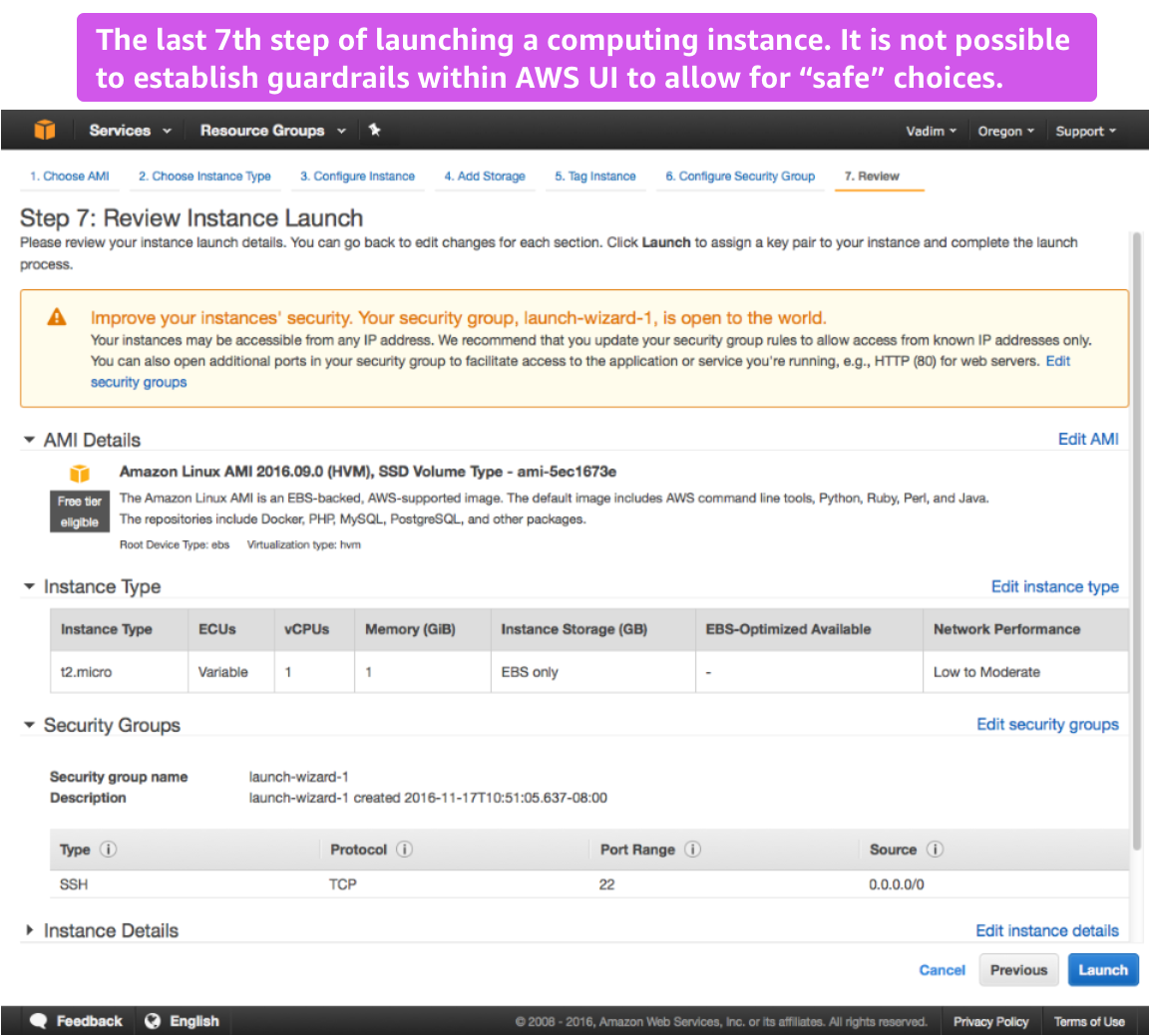
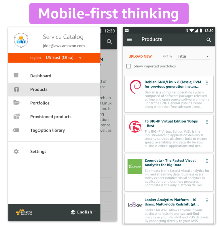
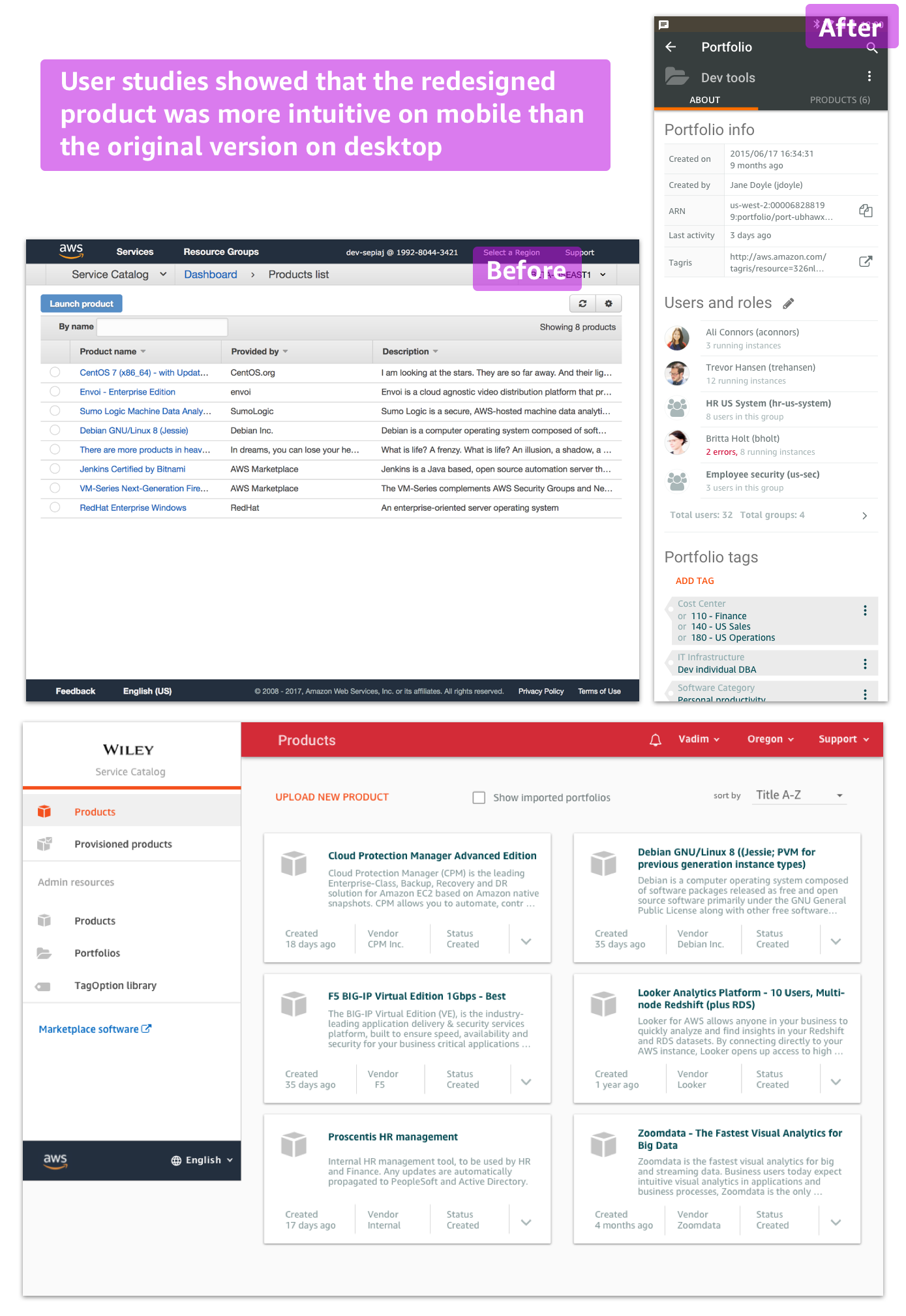
The goal for AWS Service Catalog team is to provide administrators at large enterprises with tools to manage AWS computing products and allow internal users that may not be familiar with AWS launch the assigned products. The product should be scalable, easy and work on any device, including mobile. Historically, AWS navigation a fairly complex even for developers. Service Catalog was a strategic product to simplify such complexity and win enterprises over to use AWS platform.
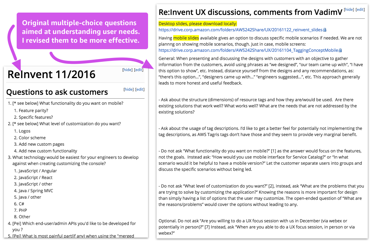
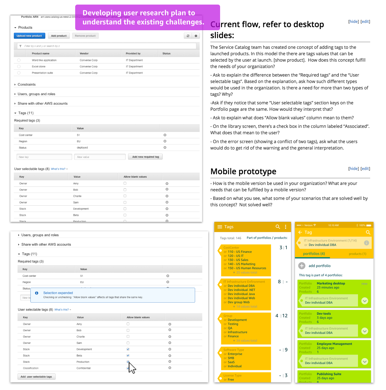
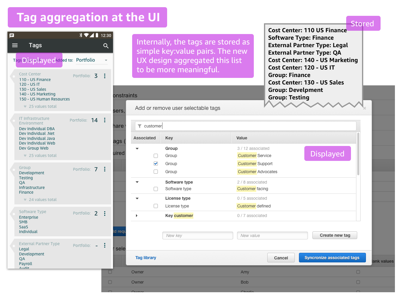
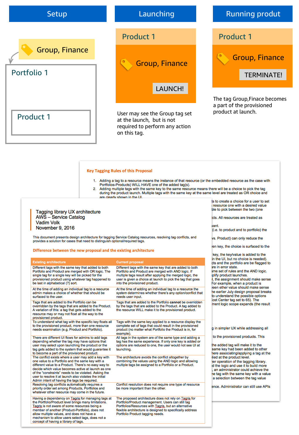
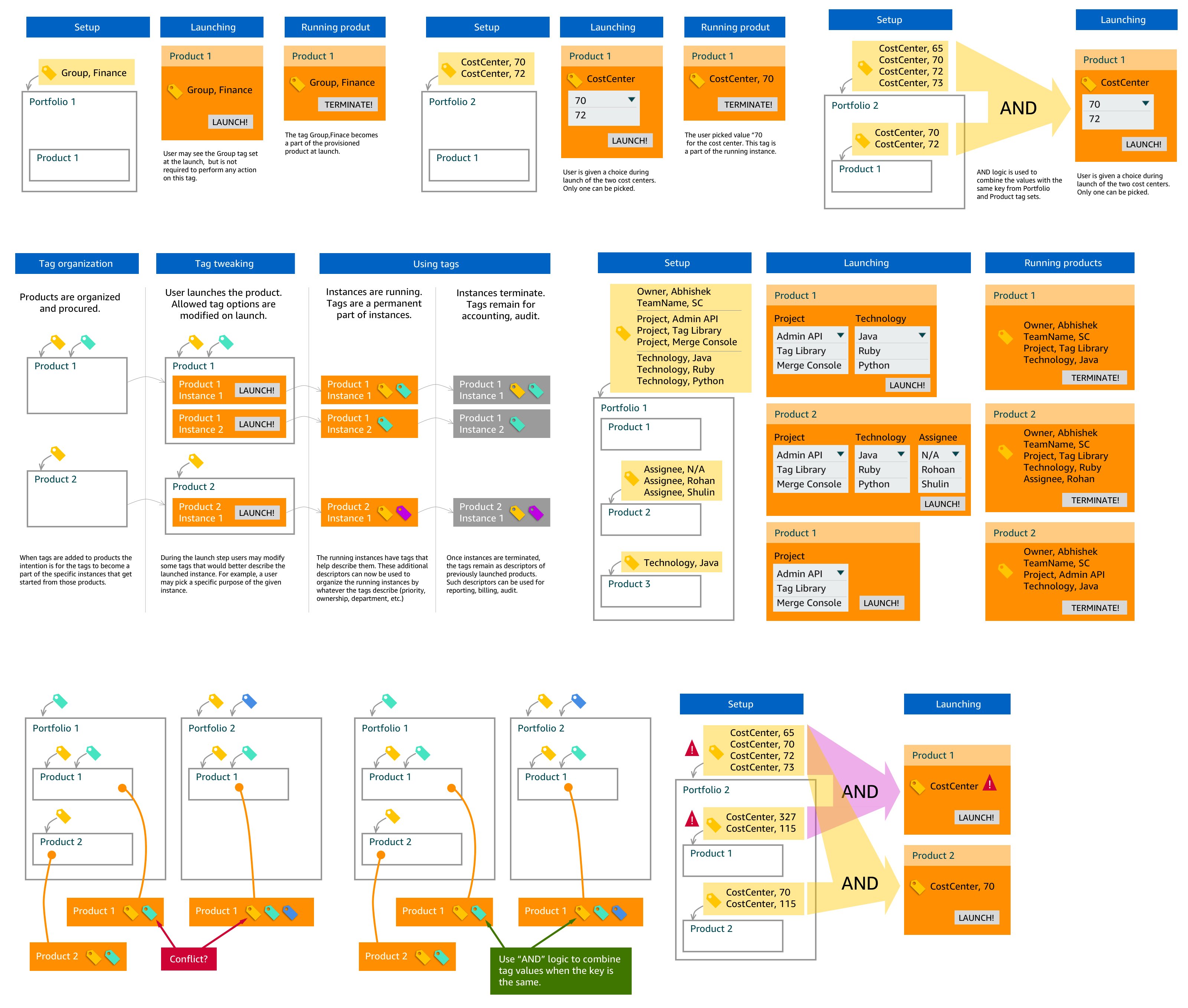
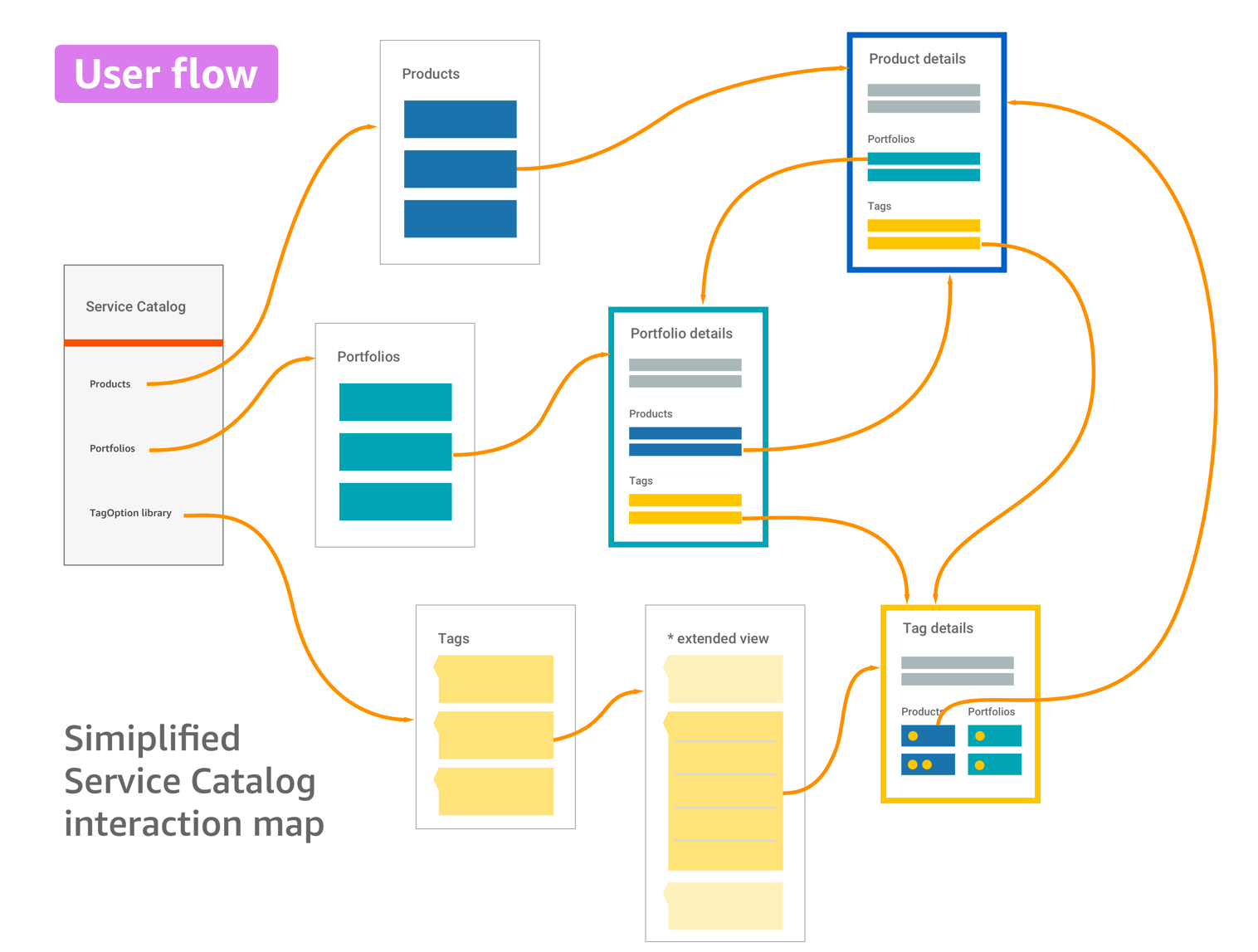
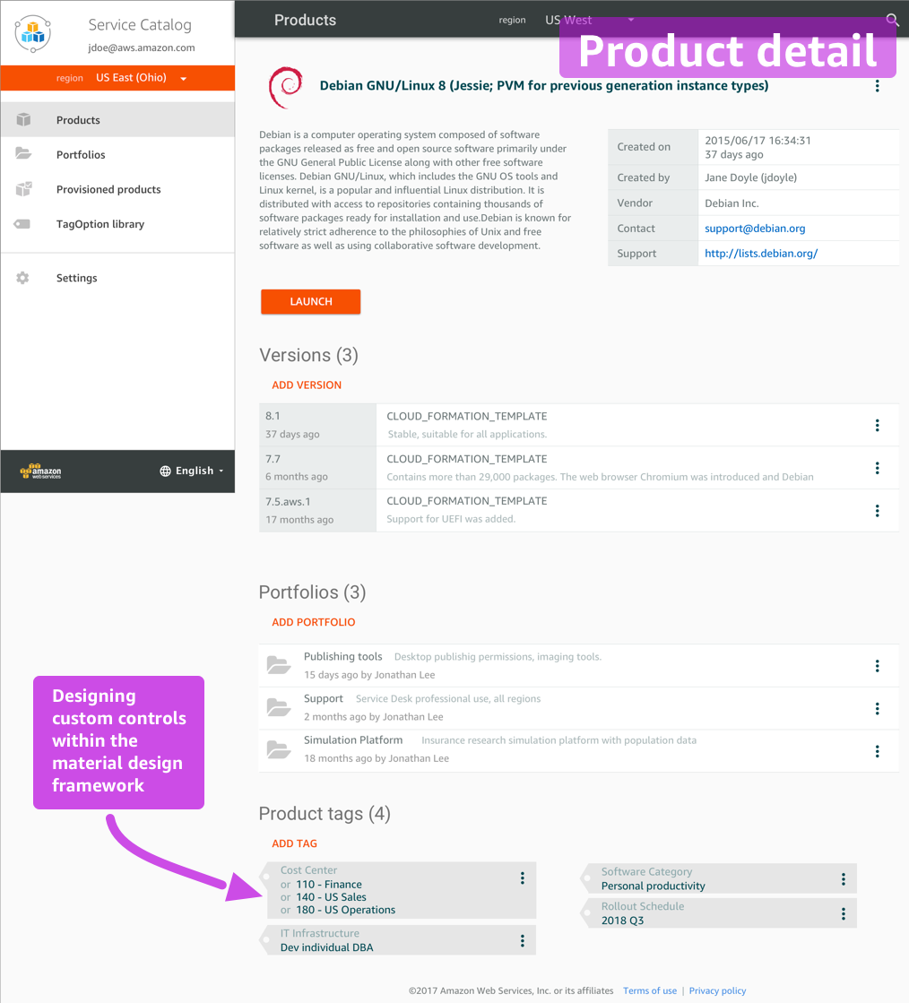
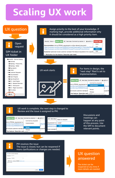
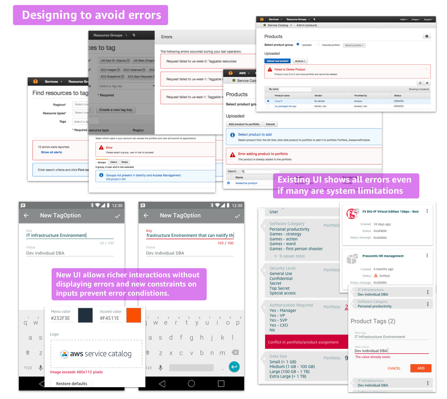
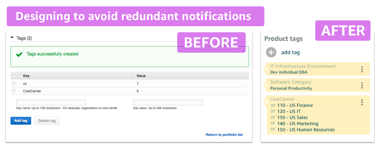
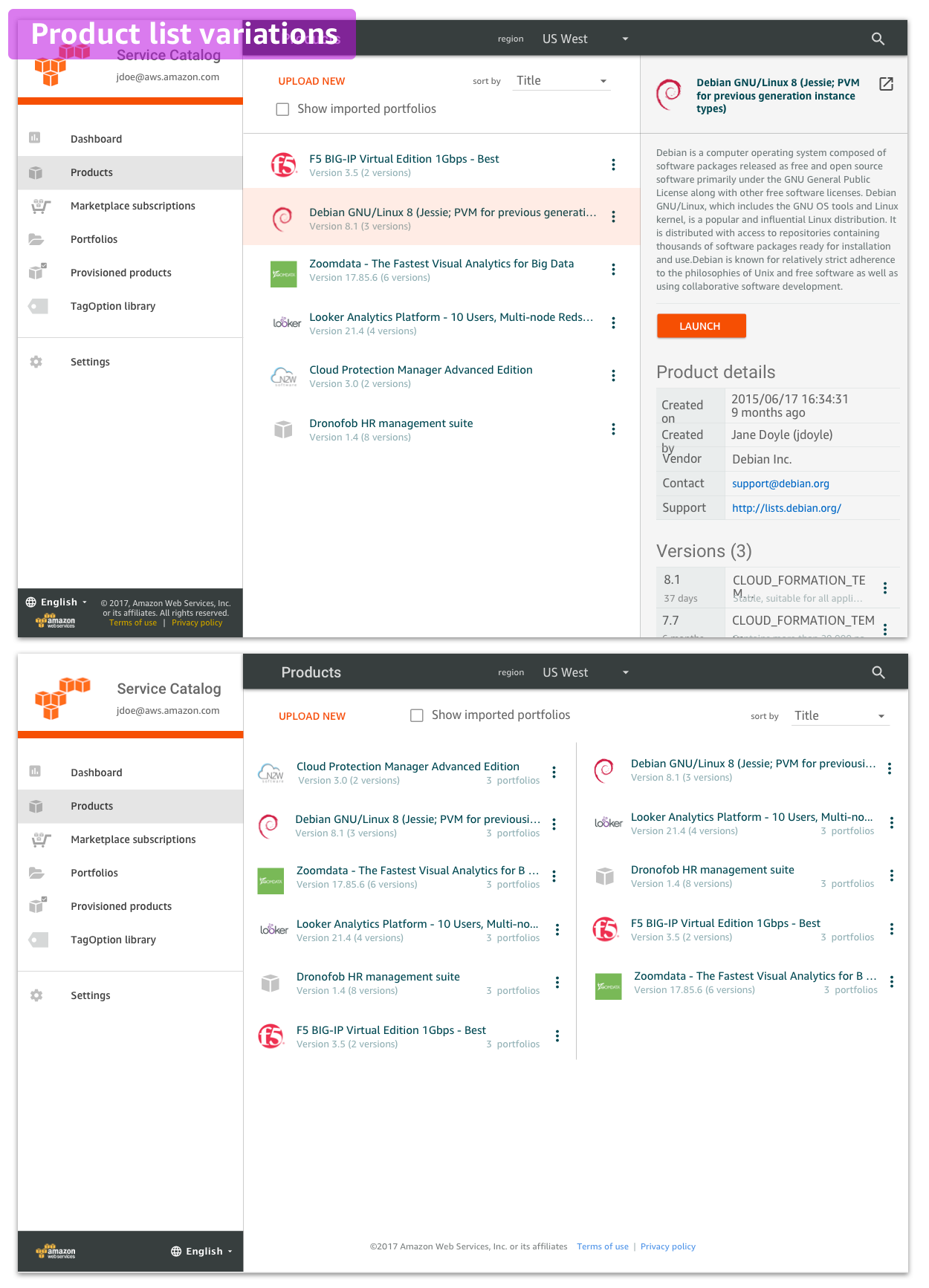
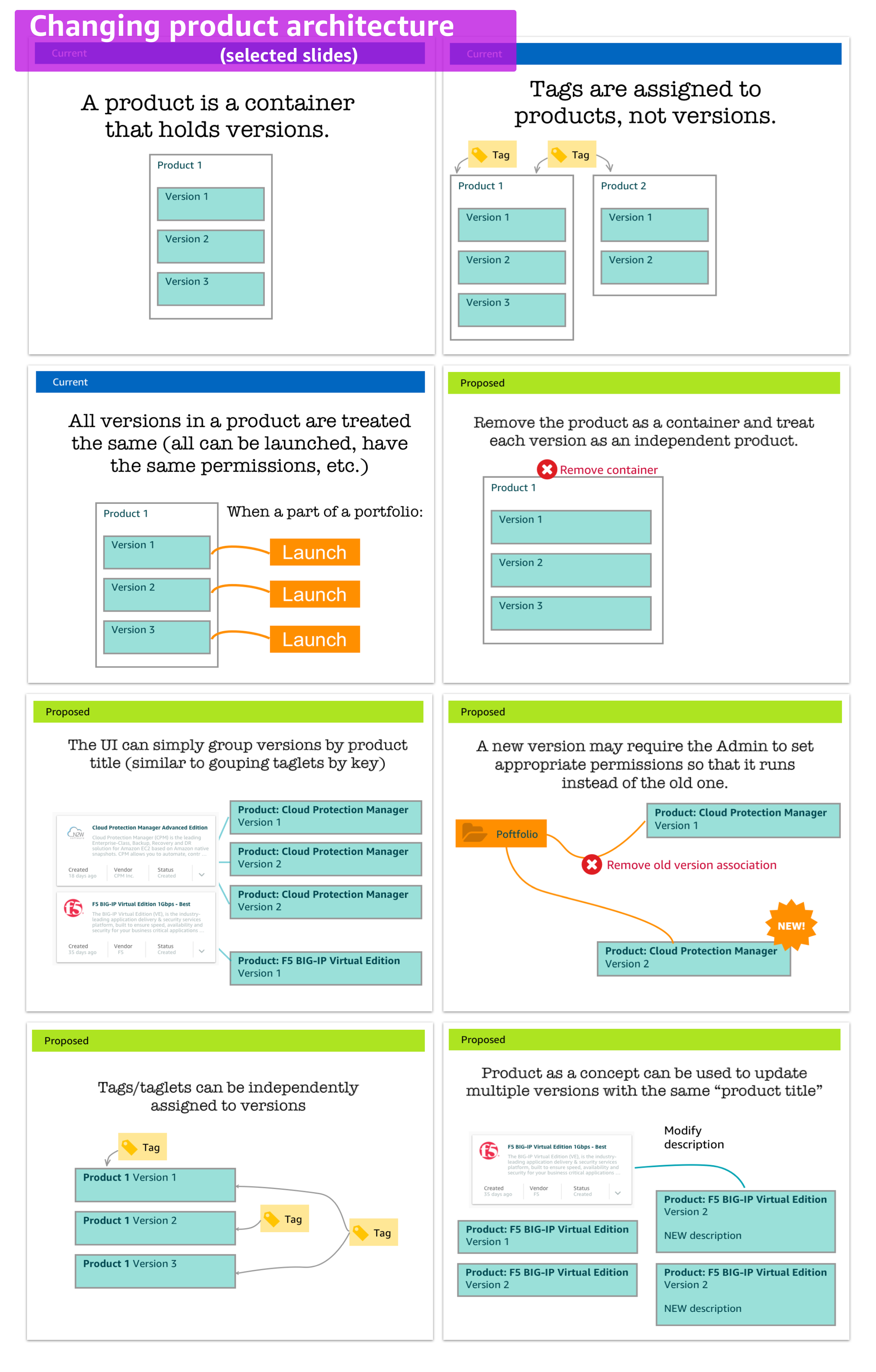
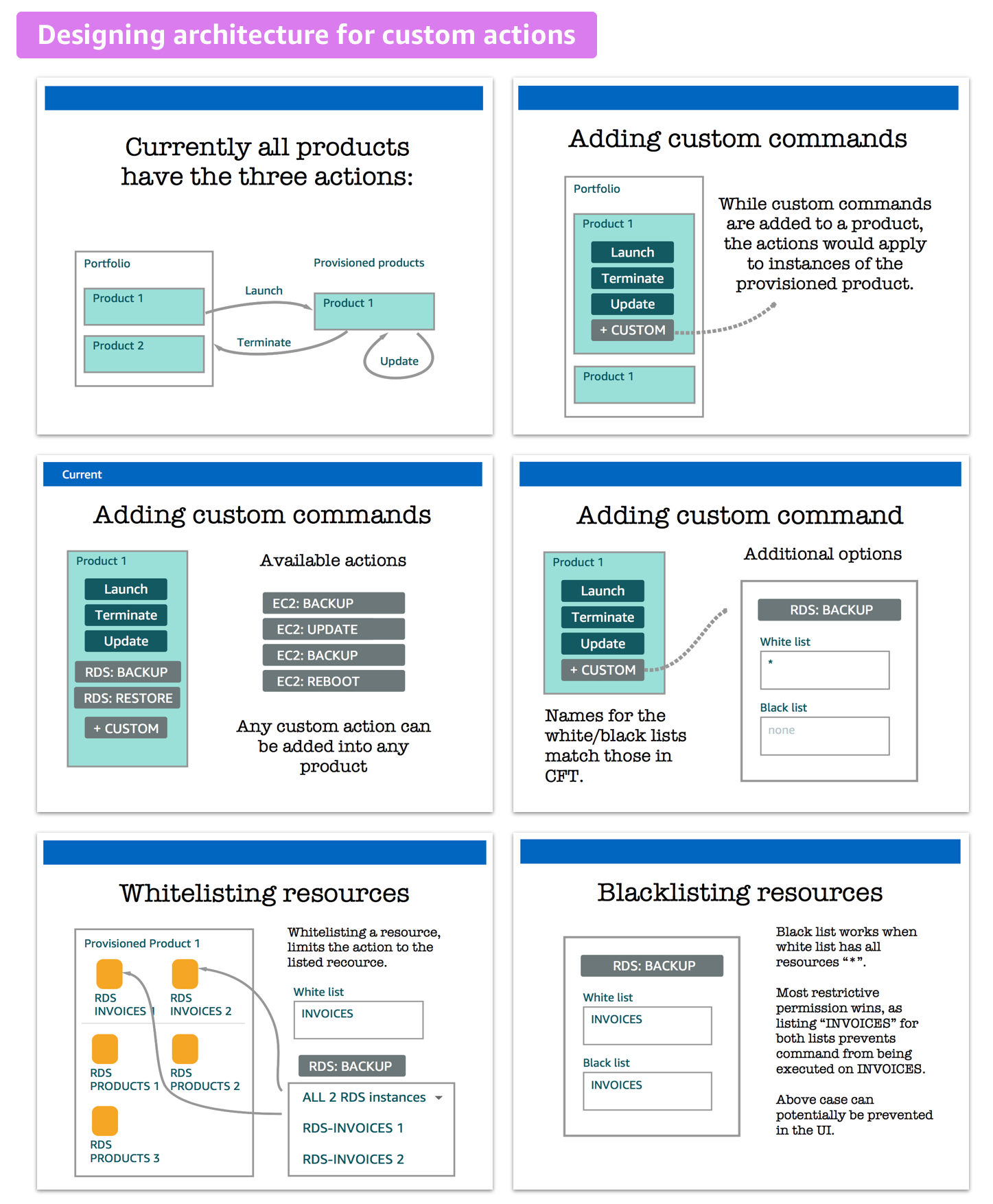
I joined the team as the lead (and only) designer to resolve certain stalemate efforts to simplify some interactions. Unlike many other projects where user research would lead to generating UX insights, this project required a different approach. It required rethinking the architecture, dependencies, storage and creation of new design patterns.
Vadim brings amazingly clear thinking to seemingly complex situations. His ability to look at an interface and simplify it is unbelievable. He thinks deeply and thoroughly and can create or discover solutions to any problem.
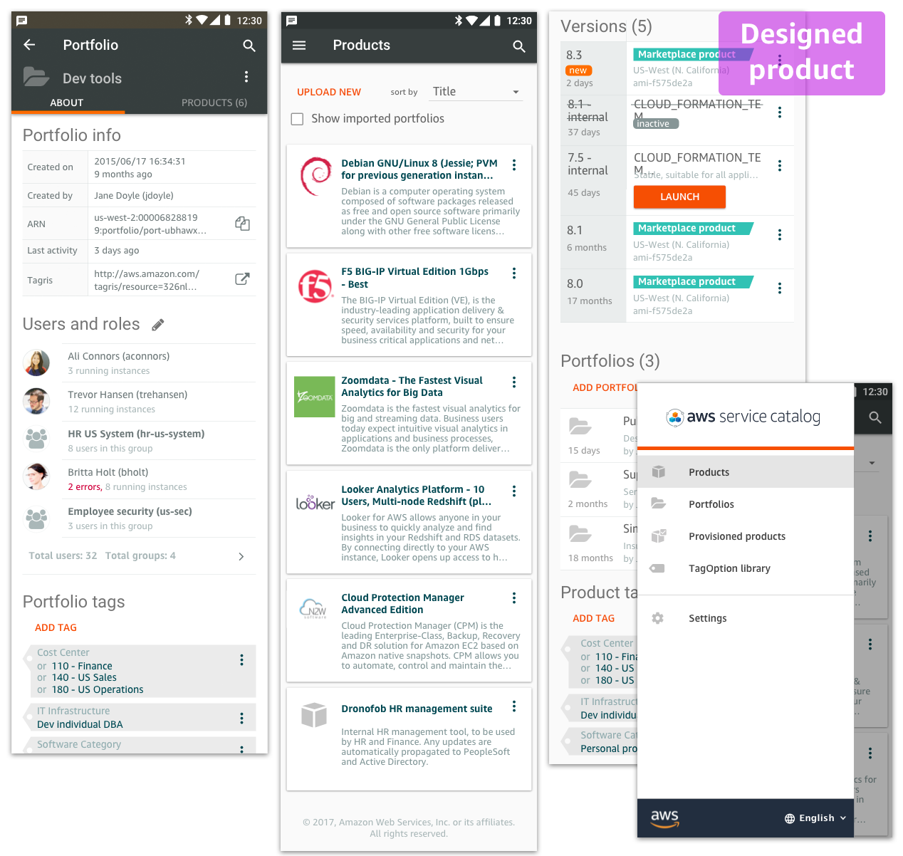
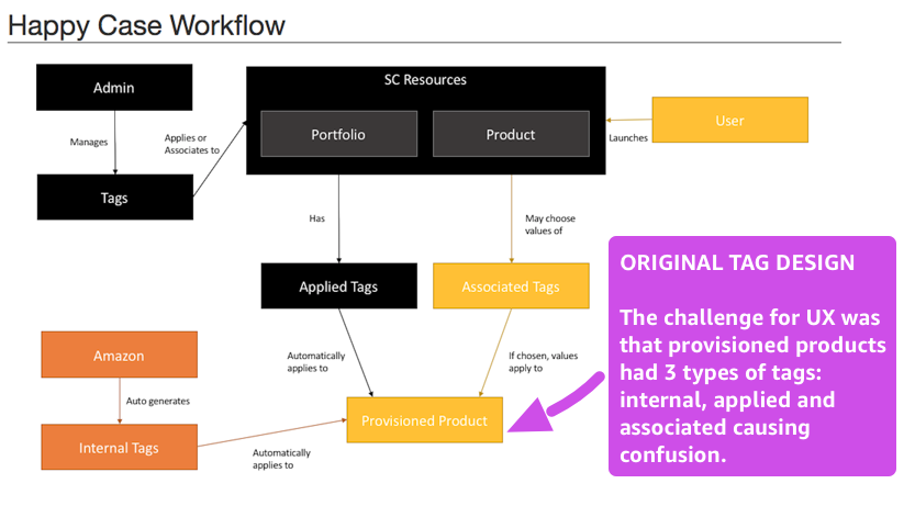
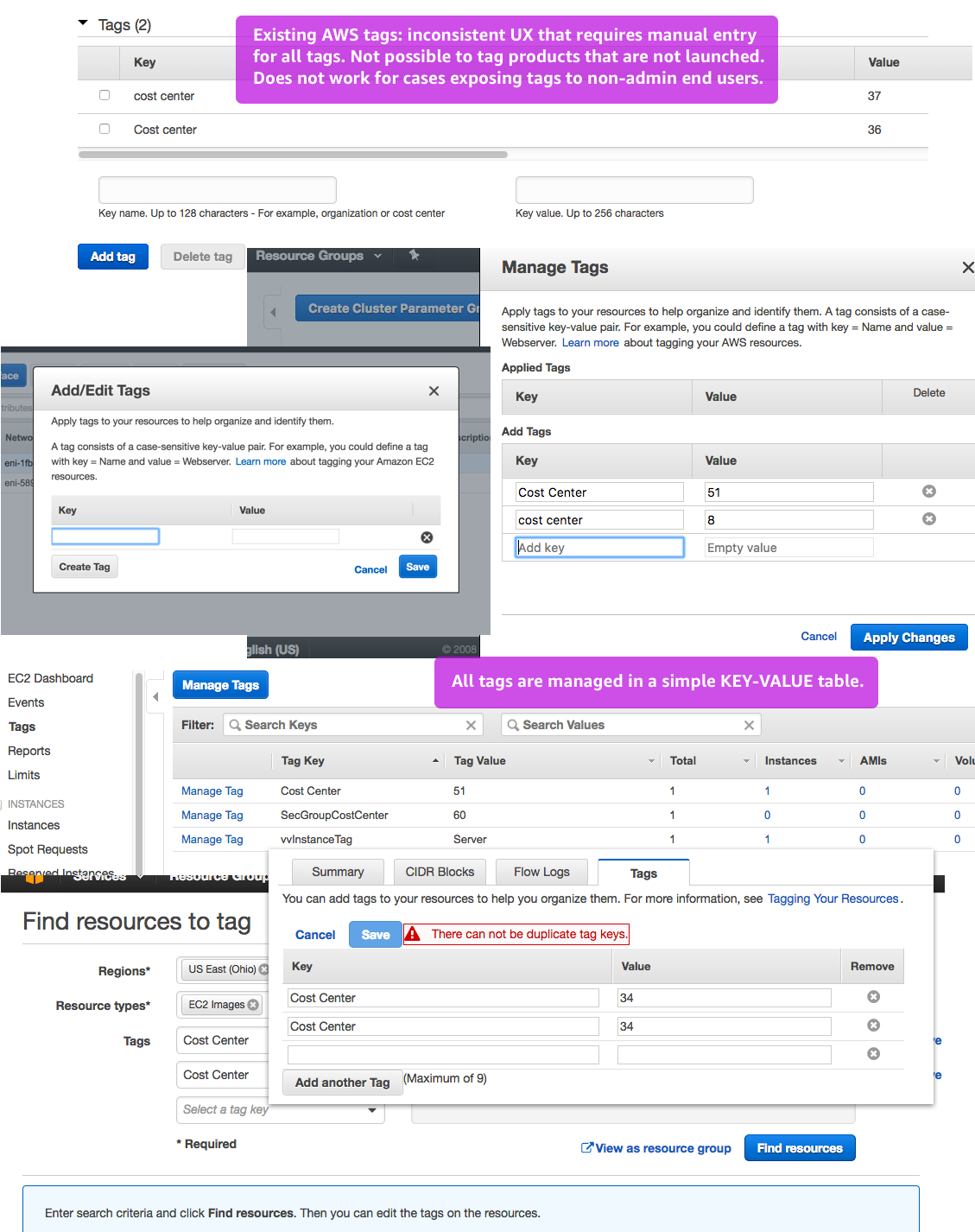
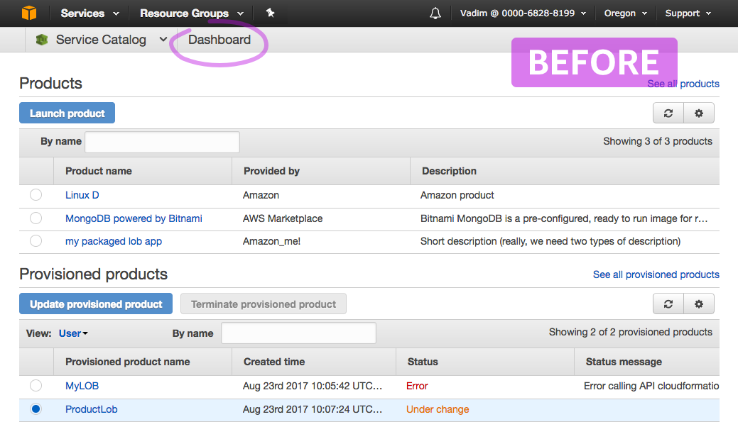
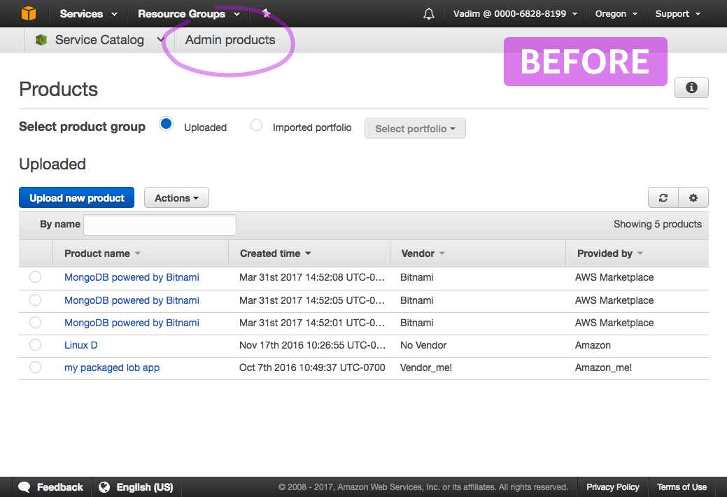
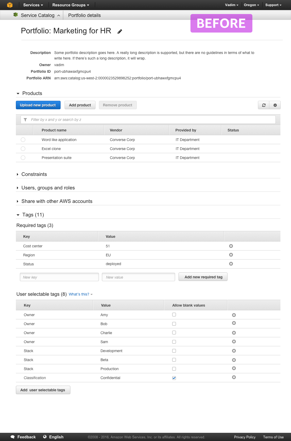
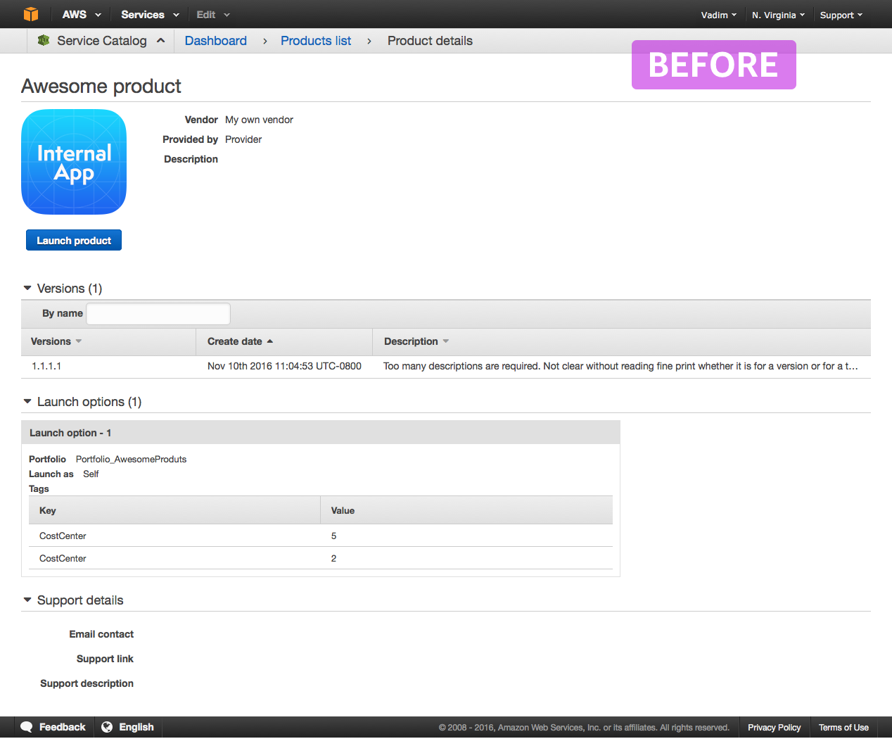
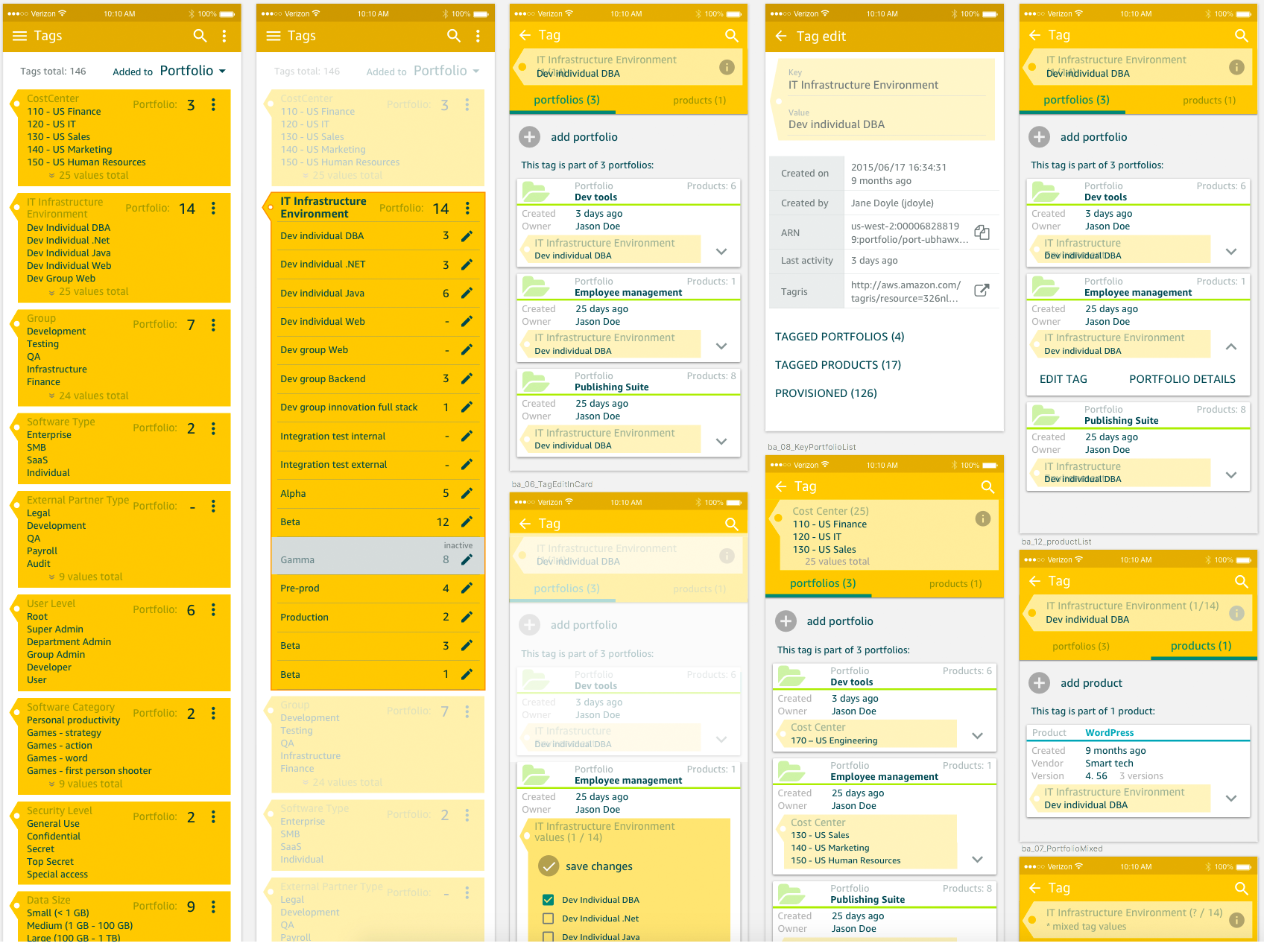
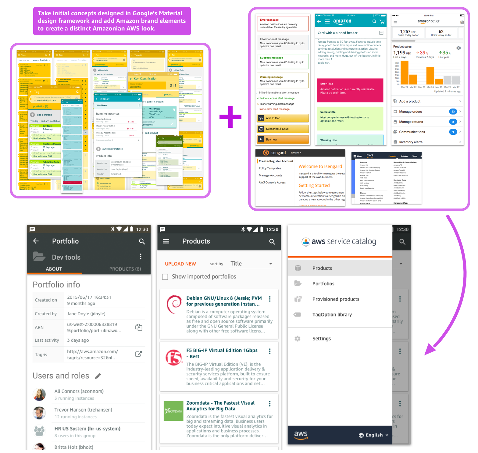
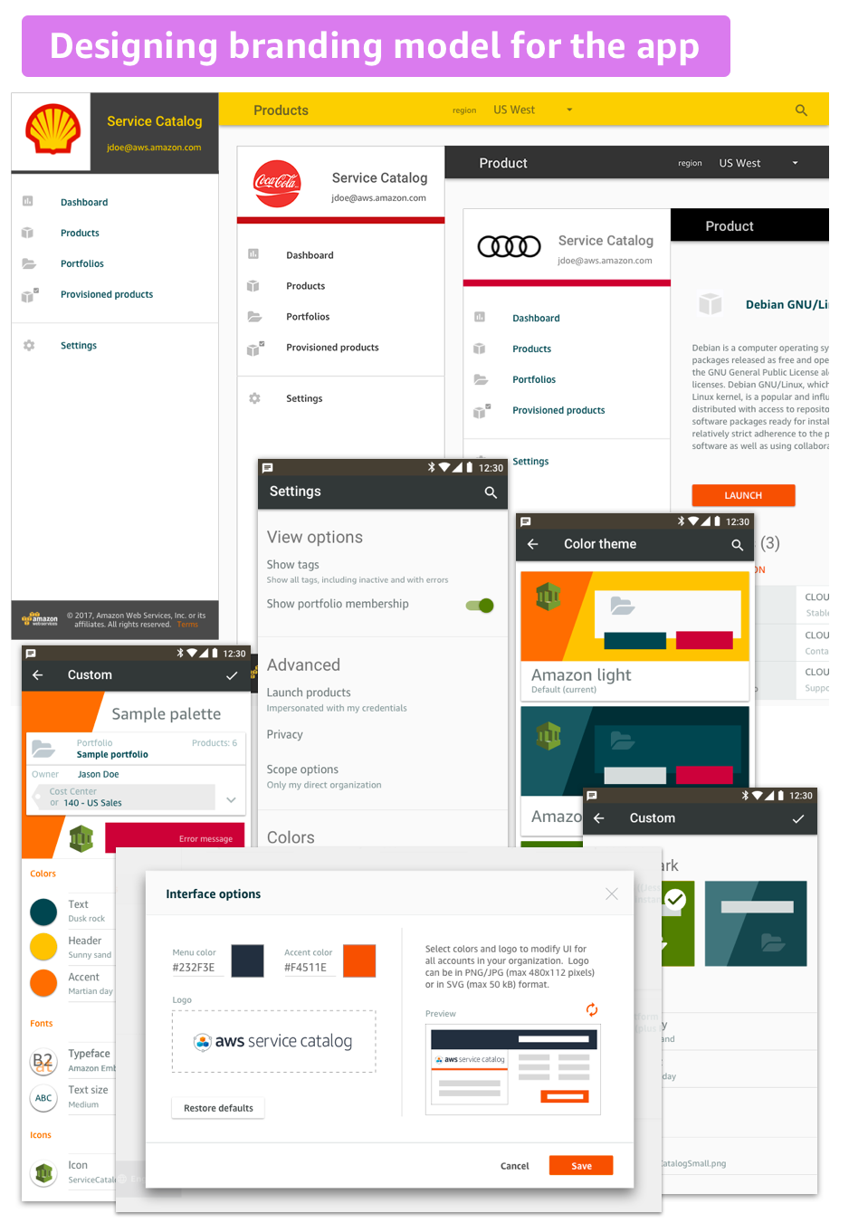
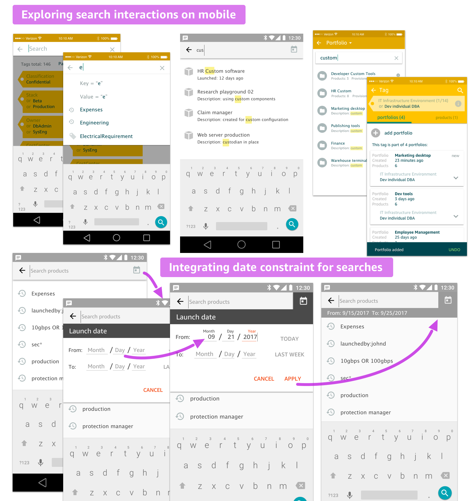
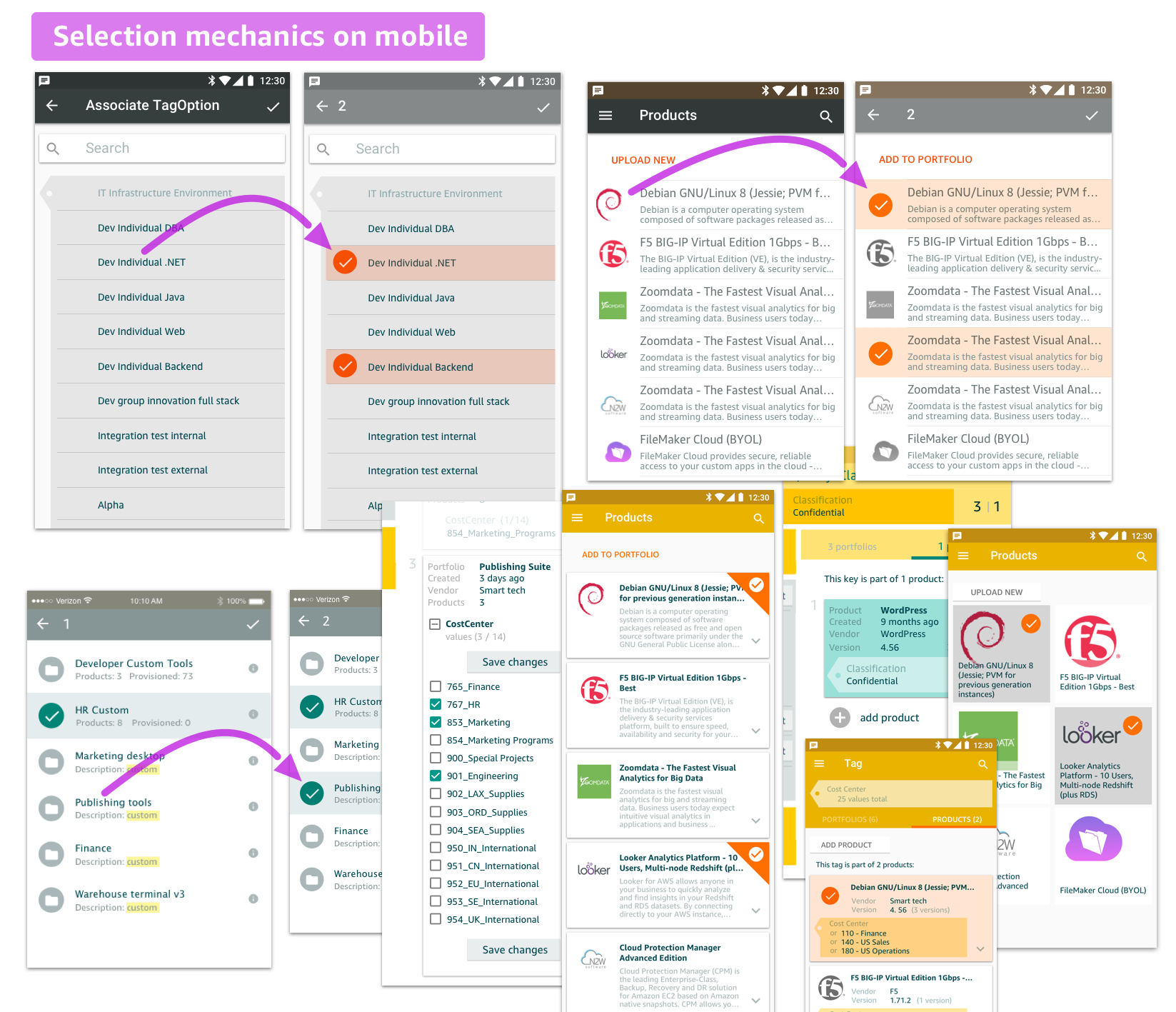
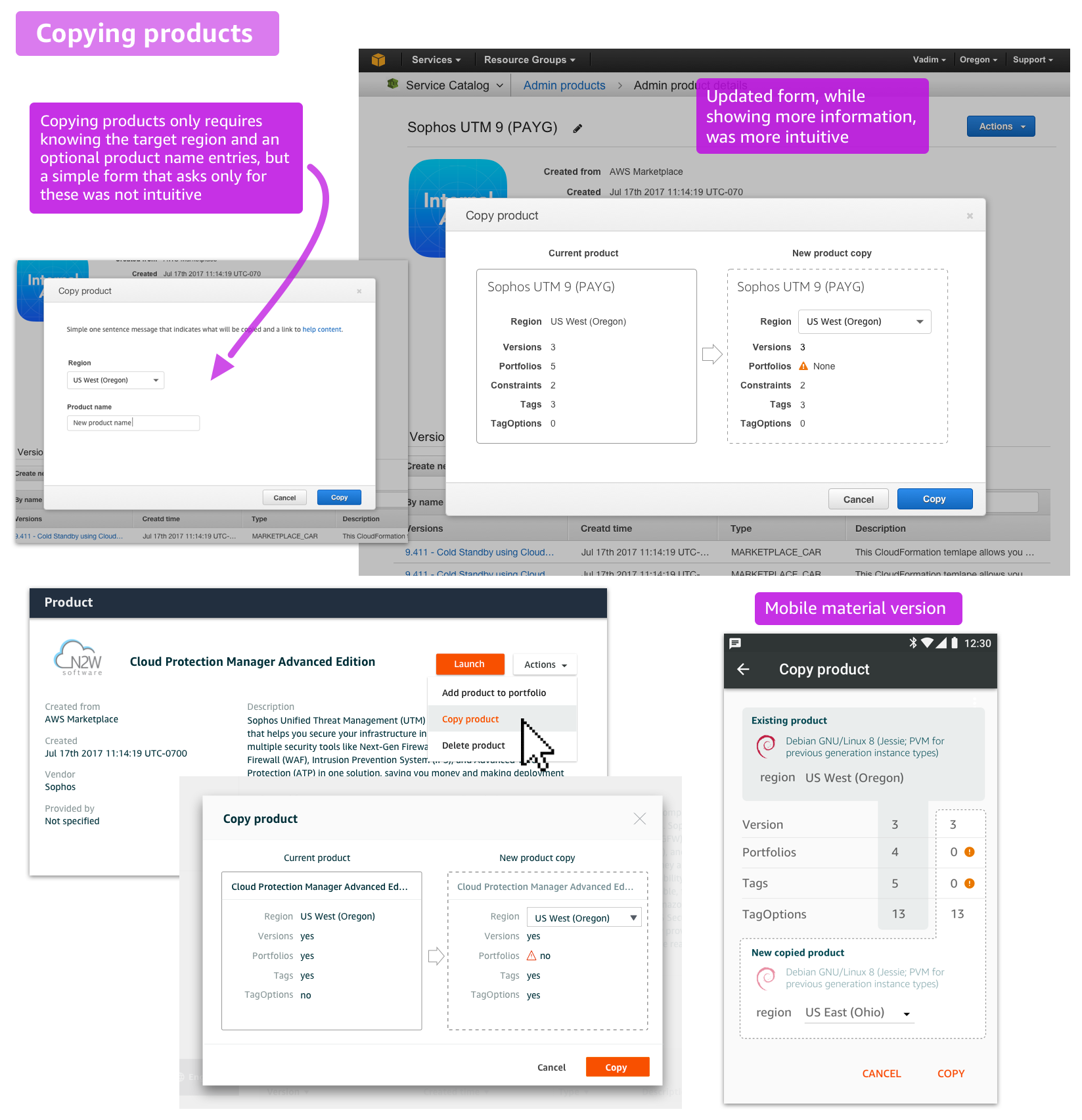
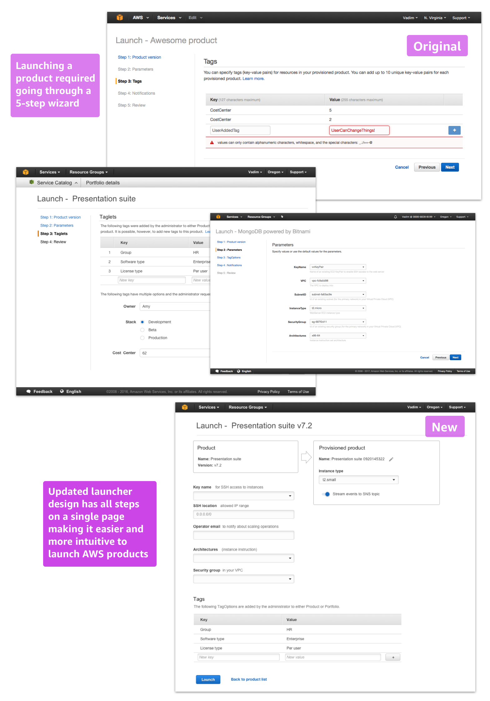
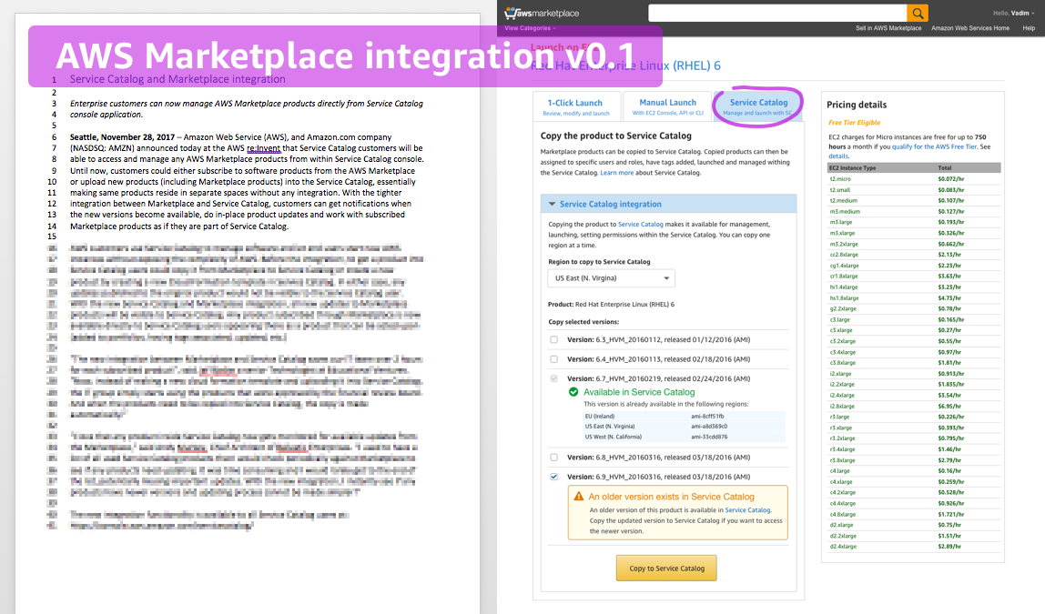
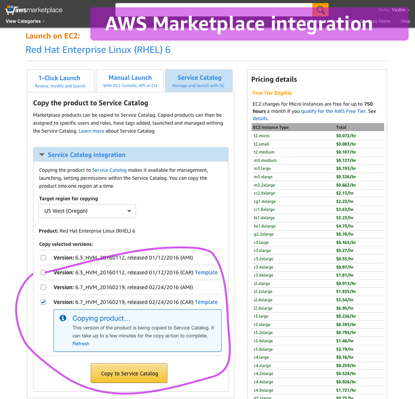
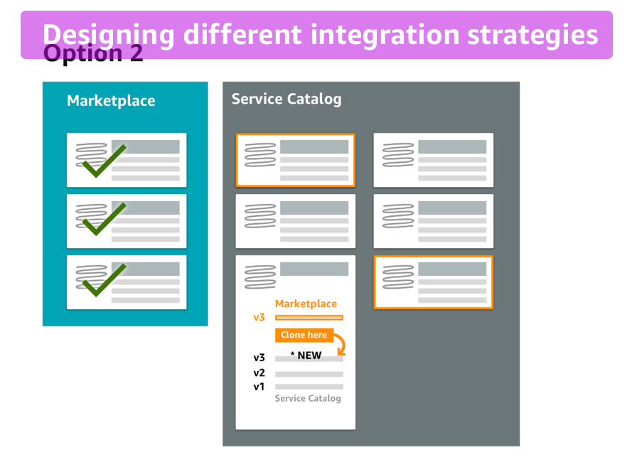
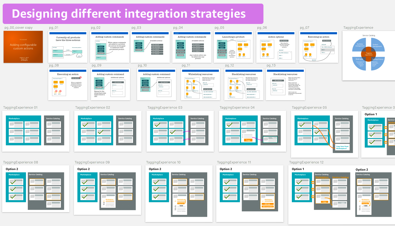
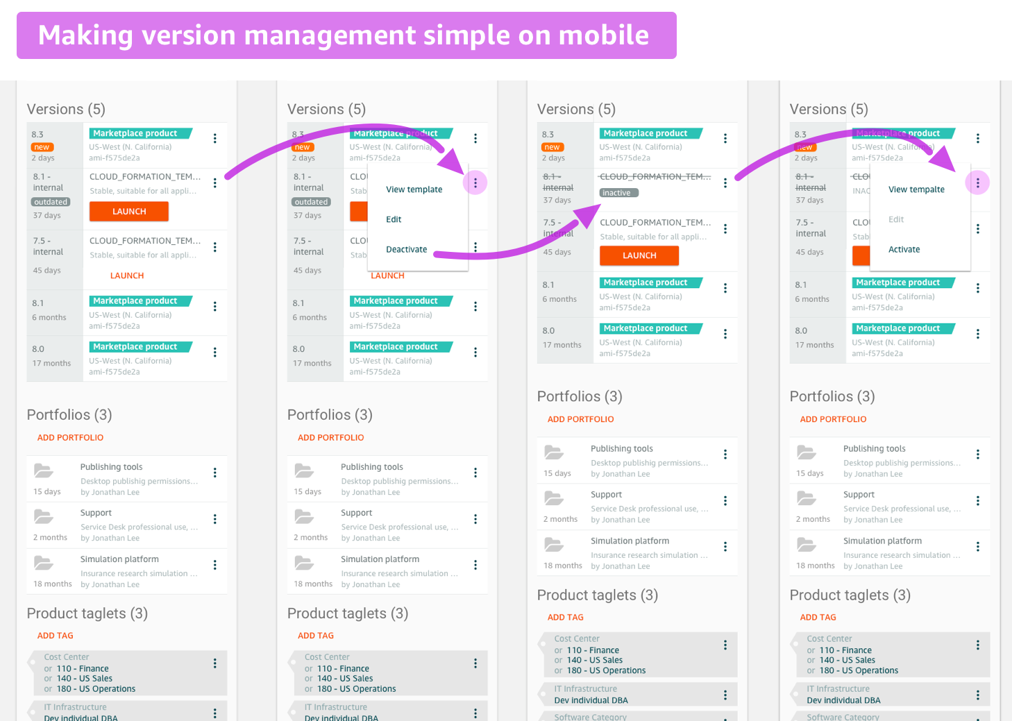
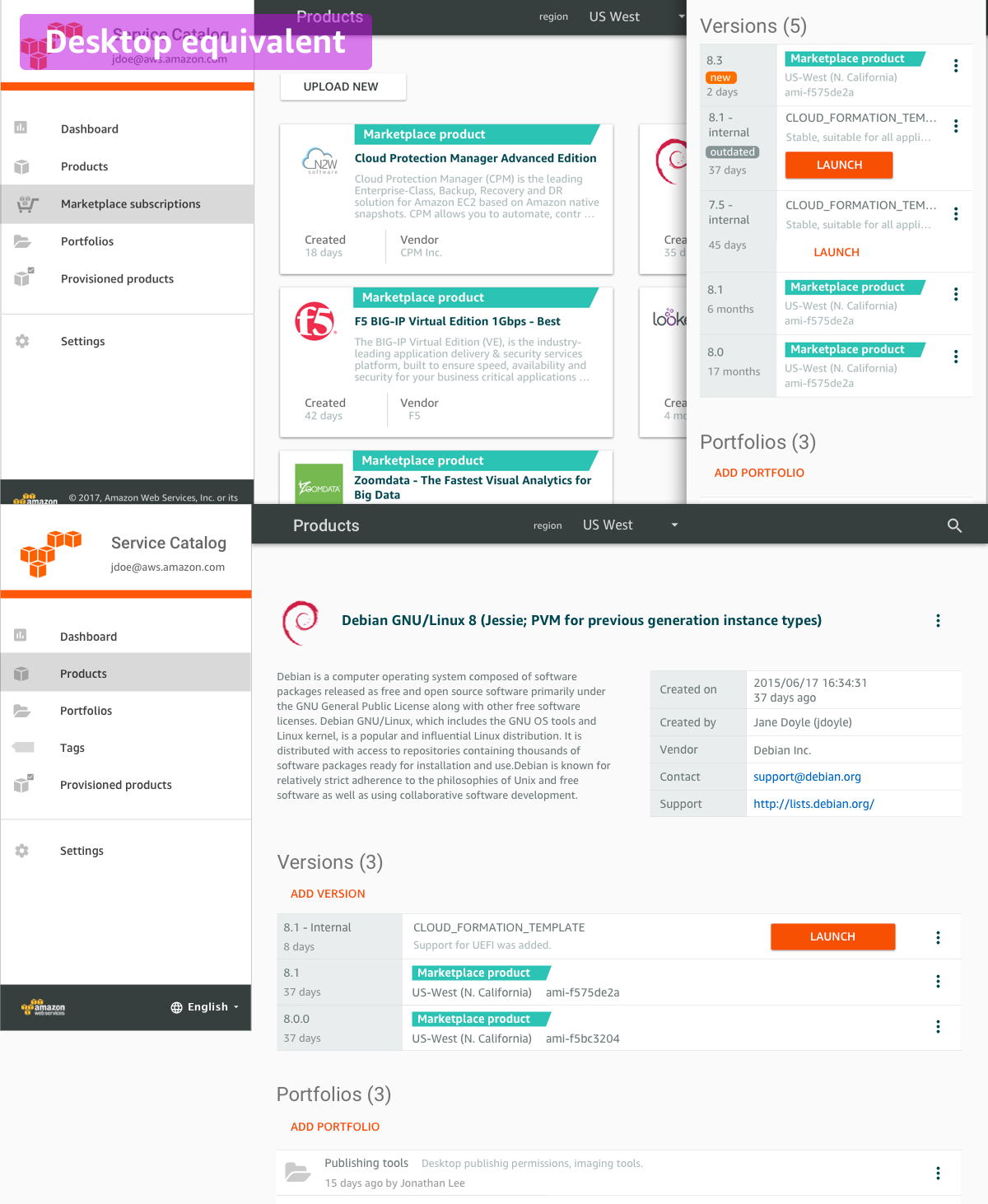
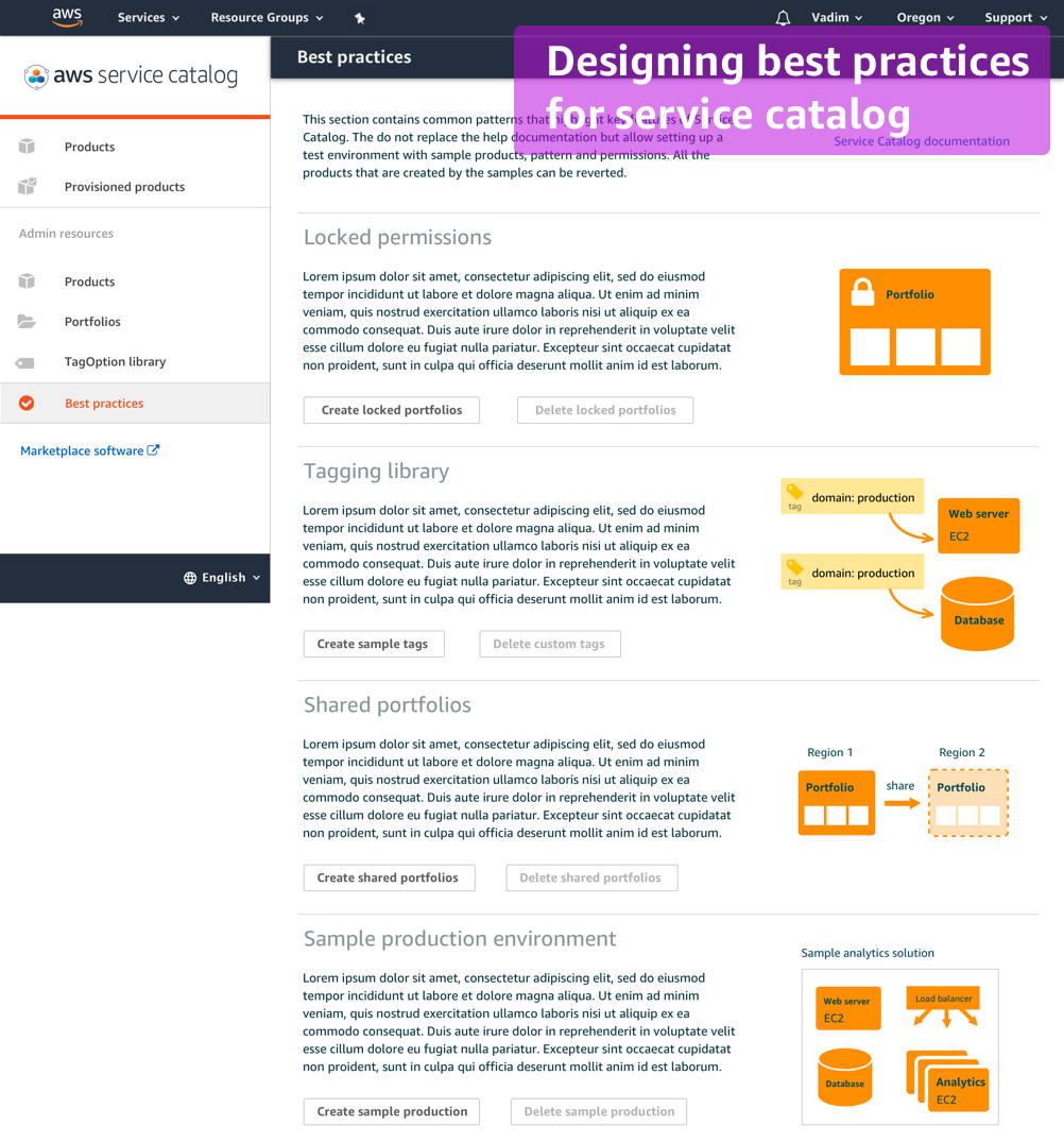
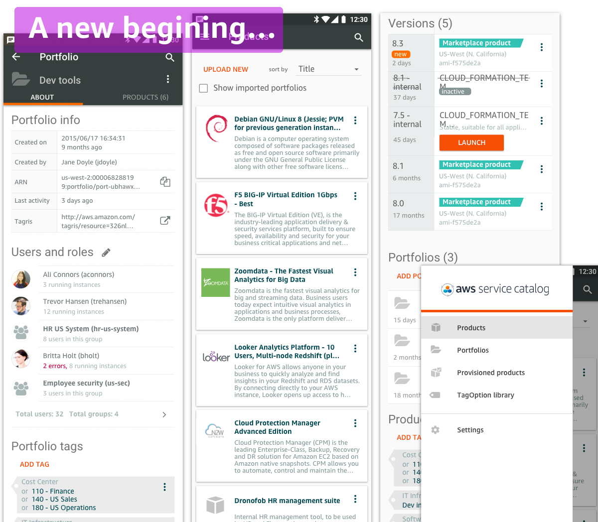
I was involved in the project for little over a year and within that time completely transformed the product. I also established the UX discipline within the team to focus on the user needs first from establishing how customer insights are gathered to changing the architecture and the designs of the Service Catalog focusing on the user needs. The effort involved a large number of cross-team integration points: AWS’ tagging service, AWS Marketplace, legal teams, solution architects, etc. Countless sketches, over 2000 mockups and a dozen interactive prototypes paved the way to a more usable product. The team also took an audacious step to separate from the existing internal Amazon design frameworks and follow Google’s Material Design guidelines, for application to support mobile platforms. We also committed to making the application brandable for companies to customize the look as well as release the framework as open source. The lack of solid frameworks to implement a Progressive Web App (PWA) and the desire to make it an open source meant we had to write the entire framework in house. Essentially, we came to a point to start with a blank sheet.
Vadim exemplifies Thinking Big and Dive Deep. He delivers designs that not only improve, but transform the customer experience. Vadim does not only produce UIs and workflows which are soundly implemented, but also the vision for new architecture and systems that better serve the customers' needs. He communicates designs in concise, actionable ways to empower teams to build and implement.
A proposed simplification was to organize all instances (products) into portfolios. Those would be similar to file folders and have permissions and users manage at the portfolio (folder) level. A portfolio concept allows for a flexible way to manage permissions, tags and constraints.
Having descriptors (tags) assigned to a resource was the key mechanism to manage permissions and allow user extensibility. Administrators could add permissions based on tags, can organize products based on tags, add constraints, etc. The original tag design relied on three type of tags: associated tags, applied tags and internal tags. This was a challenge to make them intuitive to users. Research showed that users and internal developers could not intuitively understand or retain the differences between applied and associated tags.
A concept of adding a descriptor to any AWS resourse in a form key:value pair is supported throughout AWS. Unfortunately, the rudimentary nature of tags make it difficult to maintain. There are many limitations, as: the tags can only be added to the running instances, only a single value for a given key is allowed, all values are case sensitive and UI makes it easy to make typing mistakes and each resource needs to be tagged individually. Each team within AWS implemented UI for tags sligtly differently, as shown here. While being different all tags are presented in a table with editable rows.
The team has previously done several customer contacts to collect the data that would influence the design, but not having a dedidcated researcher on the team the data was often conflicting and the questions were leading providing little value. I worked with the team to improve the questions and scale the effort of gathering customer insights.
Built upon the available AWS components, the product followed the AWS patterns along with the complexities of AWS. Since the target users were non-technical that didn't have previous AWS experience, the concepts were complicatec. Even simple dashboards for users to see what products were available to them or admin pages for the administrators to manage the existing products were not very intuitive (see below). A significant redesign was needed.
Within a month of working on new designs I realized that fundamental architectural changes were needed. I also designed a new architecture for the product changing the concept of a tag. A tag library was introduced and any product or portfolio could be tagged by a tag from a library. I removed the confusing distinction of assigning vs. applying tags. I also removed a concept of an optional vs. required tag. The same functionality (and more) was handled by a smarter back end. Changing the architecture meant starting the development effort from the beginning and there was much more scrutiny for the new designs and I had to make sure it operates well within the existing AWS tagging architecture.
Simplifying a complex system often cannot be done in small pieces and would require a new ovarall vision and architecture. The challenge was to design for every possible every case and every possible exception. I also drove the consesnsus among the team membera and with overall AWS organization that the propsed change was indeeded better than keeping the existing design.
Searching across multiple objects was not possible in AWS services. Here my team designed a way to index and search different objects, history, or intuitively make more complex queries as 'find a tag key that starts with "e"'. Historically, filtering and searching were offered through different mechanisms to a user, in my designs a user had only one a simple but very powerful search.
Tables are used to present any collections within AWS. It is also the case that all tags are shown in tables. Unfortunately, this pattern is error prone and doesn't work well on mobile. Here a new tag control was developed. The design allows for handling a single or multiple vales. In fact, the tags can be stored in an unsorted way in the backend, and the UI can do the aggregation by key. This was a very powerful and intuitive concept as our studies shown.
The architecture and the UX were getting quite solid, it became the time to make AWS Service Catalog look like the rest of AWS. A parallel effort on updating AWS logo and look has just finished so there was a new identity to match. We also considered other Amazon brands that influenced the decision on how to make the service look Amazonian.
The application framework was designed to support branding by large corporations. The framework allowed picking primary and secondary colors and would derive the rest of the application colors consistend with those. For example, it would adjust the contrast automatically to match the accessibility. Designs for different brands were developed and tested to make sure the framework is flexible enough to make the application look that it belongs to the specific organization and not necessarily to AWS.
A multi select option often can make certain operatoins easier. In our case a user would be able to select multiple products and assing them to a portfolio or set permissions for users. Using tables that easily support multi-select was not an option since they don't fit well within mobile, so new patterns were designed for selecting multiple items at once.
A user using AWS would often experience a multitude of errors popping up on the screen. Something is not set, something else failed, somethin terminated -- everything can be communicated as an error. As our target user may not be familiar with AWS we wanted to limit the display of errors. The common error cases would be user exceeding some input, or deleting a non-empty portfolio would generate an error. Most of these cases do not require showing an error, in fact, we didn't want to show any errors. Exceeding the string limit could simply be solved by preventing a user from entering a longer string, or instead of showing an error for deleting a non-empty portfolio we could delete the items inside making it intuitive and forgiving (as providing an undo). Turned out the experience can be made much more intuitive by preemptively solving errors.
Similar to errors, notifications can be annoying. The problem with them is that the notification information is communicated in a way that is detached from the design. Imagine a user inserting a row in a table. A notification could show a text stating "A new row was inserted". But processing that notification requires extensive comprehension and it doesn't link the message to a potential question "where the new row was inserted?" A better approach is to show the effect of the user action directly in the UI. As inserting a row could hightlight a new row in a table with potential controls to undo the action. This would avoid confirmations and instantly provides a feedback about the user action.
Many different options were designed for managing a collection of items. For a product list, the products can be arranged in cards, lists and there are many variations about the details. Generally cards can be more more flexible for showing inormation that may vary from card to card (as showing error state within a card). Here are some list designs that we tried.
While the small may seem insignificant, a good design makes sure that details are not overlooked. Here's an example where I noticed that the legal copyright string was too long for mobile and wasn't communicating the proper message. Generally, showing a copyright string is a good way to indicathe the end of the page so it does serve a purpose besides simply displaying a copyright information. In this case I researched the need to display a range of years and the need to show "All rights reserved". Turned out, those parts are superflous. I got in touch with our legal team and was able to change the copyringht notice to be a tad more user friendly. It also fit nicely on mobile.
AWS Marketplace is similar to Amazon shopping for software. It is a place for users or administrators to discover new software packages and try them out. Since I was working on AWS Service Catalog (an internal catalog of software) users could greatly benefit from a way to simply copy products from AWS Marketplace into the internally managed catalog of products. I designed several integration strategies starting from the basic initial release where users could copy the products to a full integration where administrators would be notified of the new versions and having a complete managed lifecycle.
As many of the architectural pieces were coming along, there was one sticking point remained preventing a fairly straightforward UX from being developed. It had to do with products and product versions. In the existing architecture, the product was a virtual container that had multiple product versions stored inside of it. When a user launches a product, a specific version within that product would need to be picked to run. That means while the user thinks about launching a "product" the actual "version" would run. It may sound logical, but in reality odd things were happening. There could be two different product containers each having identical versions – this would be confusing to have different names for the same product. Also when a product needs updating, a new version would be copied inside a product container. But which product container needs updating? This would be ambiguous. A better architectural approach needed to be developed. At this point I had a good understanding of the user scenarios and was able to design a better architecture. In essence, instead of having a product container, only versions would be stored internally. To the user, similar versions (all versions still have a “product name”) would be grouped together and can be managed as one entity. So most previous scenarios would still work as before: removing a “product” would translate to removing all similar versions. But in the new architecture, there would be no case of duplicated products or ambiguity about which version to update.
It is impossible to predict what type of actions a product may need to handle. Since here we deal with enterprise clients and AWS products, all “products” are virtualized computing instances. All products would need to support an action to Launch and Terminate and maybe Update. But besides these three actions, the support for other actions may be product specific. Within large enterprises, admins may want to define what those other custom actions might be, what products they may apply to and who can or cannot execute them. But what would the architecture be to support such flexibility? I designed the architecture to support such actions. Essentially an admin would create a global action, say “backup” for backing up databases and specify a namespace to indicate the type of computing it applies to. Since almost all computing instances are running within EC2 types, the custom action could be “EC2: Backup”. At this point we don’t know which instances are databases and which are not. There would be concepts of a white and a black lists that would make that such a link. In the backup case, an admin would be able to whitelist “INVOICES” instances and all the invoices databases would now have a custom action backup that can be executed. Alternatively, a user choosing a Backup action would be able to run a backup command on all Invoice instances.
One of the challenges with AWS in general is the complexity of creating a solution. There are many multi-step tutorials that exist for creating solutions, but it is a challenge to create a multi-resource environment and have an ease of tearing it down when needed. Service Catalog offers a native ability to define solutions by linking multiple products and launching them as a single solution. It would be helpful for administrators to offer common sandbox environments where enterprise-class solutions can be tested. Here’s one of the designs that allows users setting up “best practice solutions” within Service Catalog. While it may look simple, the concept of providing such enterprise-grade solutions is unique.
As with any AWS product release, there’s an extensive collaboration with other teams to coordinate beta, testing, launches, generating training material, working with Solution Architects on evaluating the product and with technical writing team to create help content. The Service Catalog product that my team was building went through significant changes and those need to be documented in the public help content. As part of driving a change, I created many architectural diagrams and UX prototypes to sell the new vision to the team. Those diagrams became the official help content for AWS.
User research was generally an ongoing process throughout the product development. Due to complexity and the primary focus on the largest enterprises, there were challenges to recruit participants that would have understanding of the needs of large enterprises. We established an ongoing dialog with some key companies through and called it Customer Advisory Board. Through such discussions, we could get a better understanding of the user needs and get feedback on our solutions. I also partnered with AWS research team to develop personas and make sure we are delivering a consistent message across the entire AWS.
I joined AWS Service Catalog team with a simple mission to design a screens to make the enterprise AWS product more usable. The product was in a beta state and without usability improvements specifically targeting large enterprises, AWS faced missing out on many large contracts. There was no prior UX involvement on the team, and the project seemed to be a short one. What ended up happening is focusing on the user needs completely changed the nature of the product and the nature of the development. I not only created the mockups, but redesigned large architectural parts of the product. That meant taking a step back and rewrite large portions of the product. I was able to drive consensus on the team and change the foundation of the product. The design was a fairly large undertaking as well: completely new patterns had to be developed, the ubiquitous table-based AWS paradigms had to be changed to something else as they didn’t work well on mobile. For overall development a new framework had to be designed and we based on Google’s Material Design. Also the application had goals to be brandable so that enterprises could match their own brand colors. We also wanted to allow offline operations so we picked to develop a Progressive Web App (PWA). This was the first effort at Amazon that I know to depart from many internal design frameworks and adopt Google’s Material Design principles. The goal was also to develop a flexible framework that can be open-sourced, so a lot of effort was spent on understanding the licensing of every design element so that we could release an open source version in the future. There were many smaller design project along the way involving cross-team integration with other AWS teams that touch enterprise management and with AWS Marketplace. It was a year full of accomplishments and delighted customers that were showcasing my team’s designs as great examples of intuitive applications.
The new architecture, designs, and the established focus on the user demonstrated that having UX involvement earlier would likely to save time and not require significant rewrites. Having a successful product that was unlike anything previously released by AWS was a blessing and a curse. Customer were happy but the with the change of management the vision had lost some key allies and a question became “why does it feel like it is coming from our competitor Google?” While the look of the product was specific to AWS, the feel adhered to principles of Google’s Material Design framework. At the same time a new initiative within AWS was underway to unify all internal AWS applications under a new design framework Polaris. One thing certain about Amazon is that things never stay still and will change. While the designed foundation will likely remain in the foreseeable future, the look of Service Catalog will likely change. And a new cycle of iterative design starts, but this time it is grounded on a solid foundation and the focus on the end user will remain…