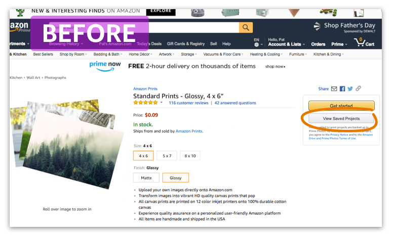
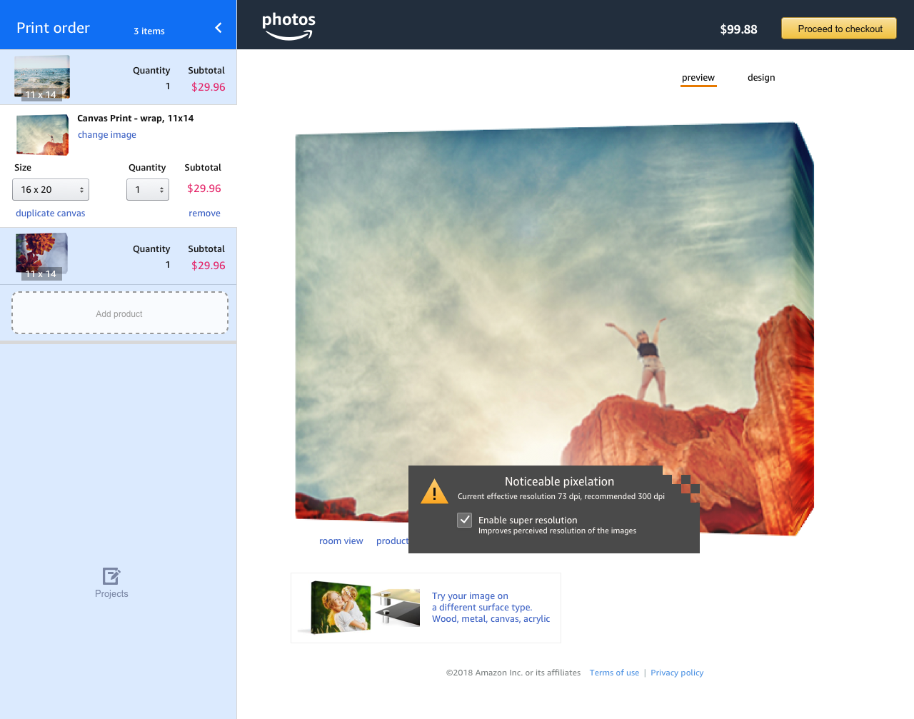
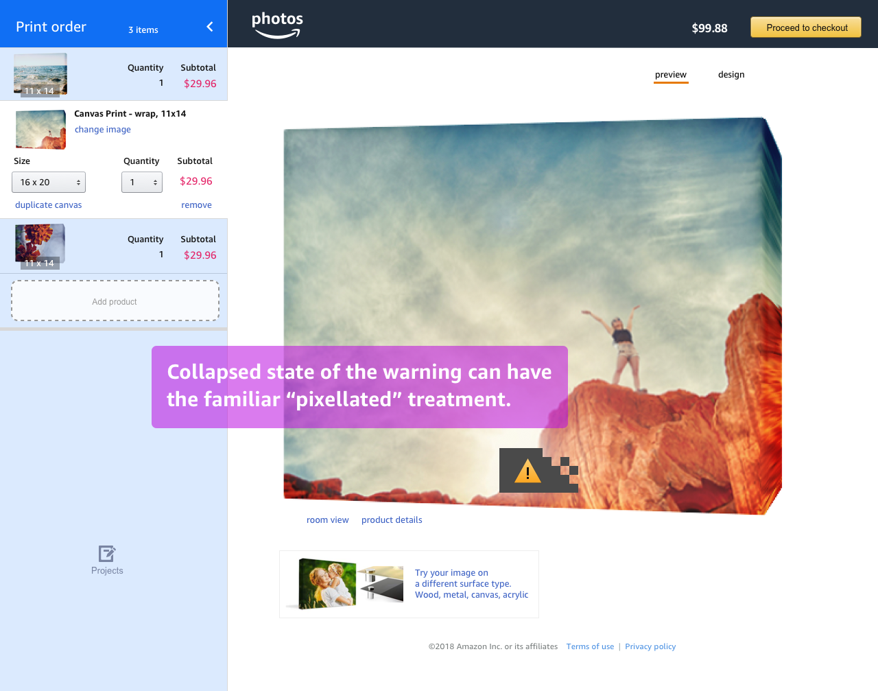
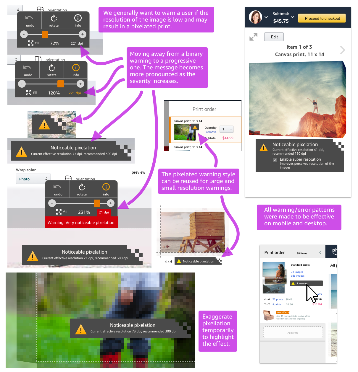
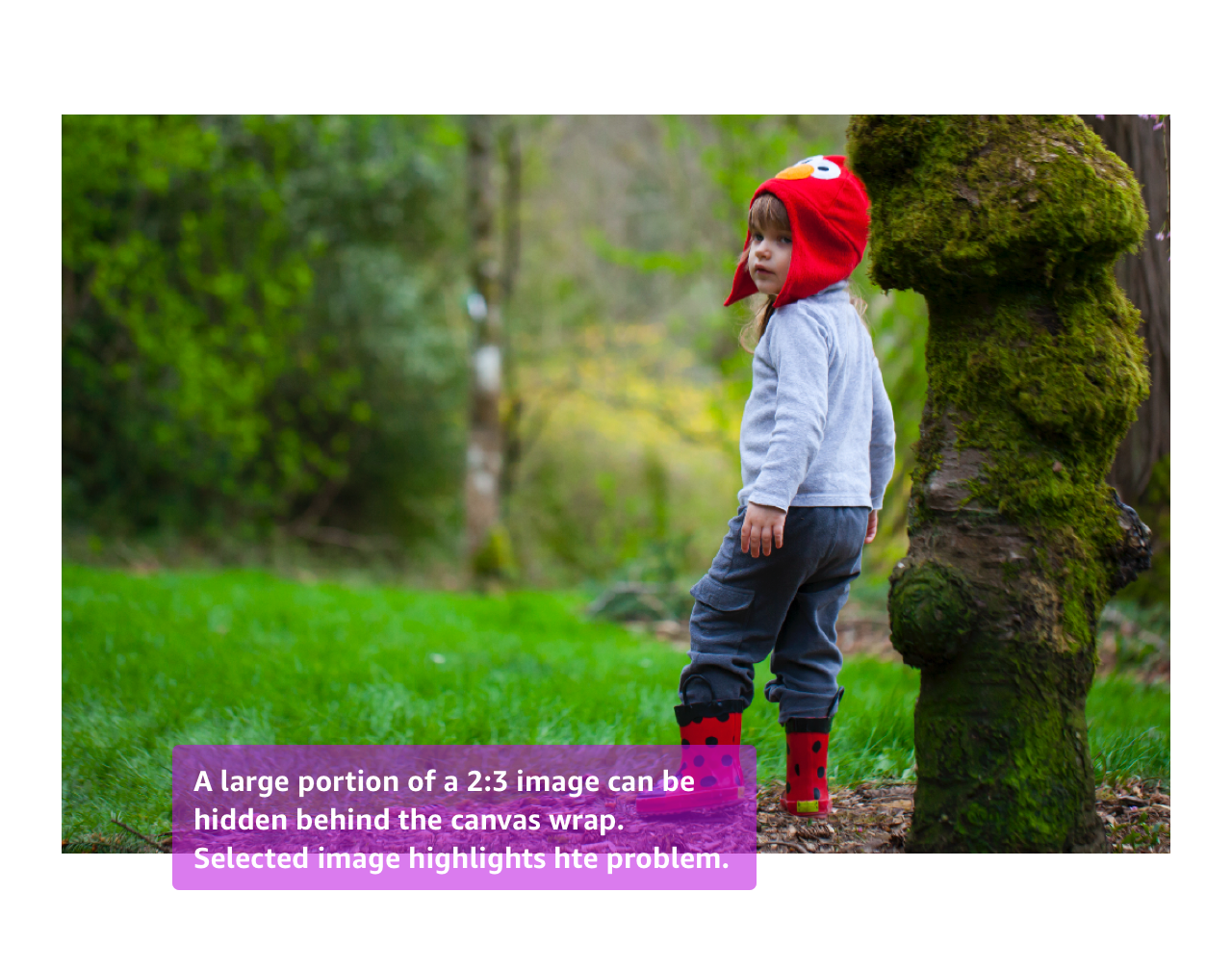
Designing a way for users to order custom wall decor products that led to redesign of most of the printing experience.
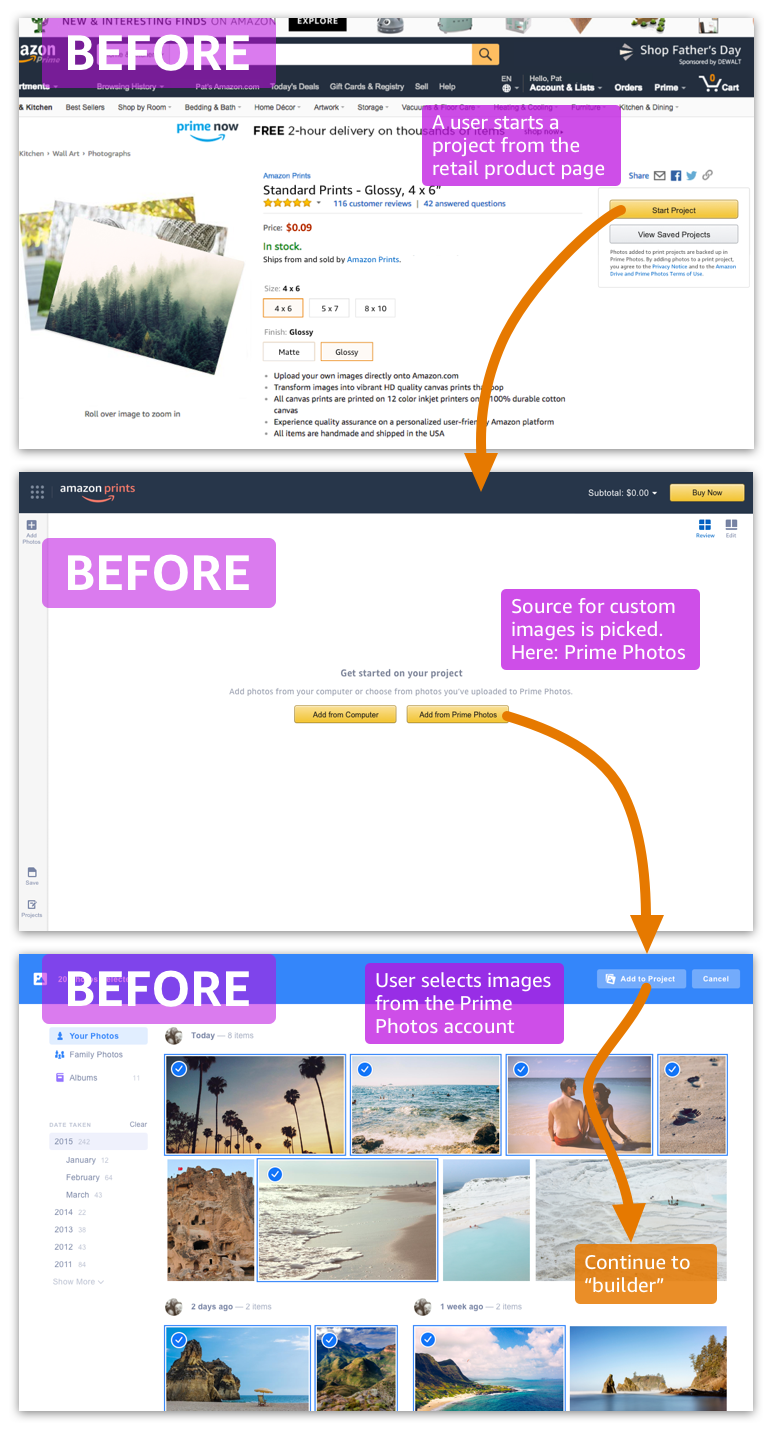
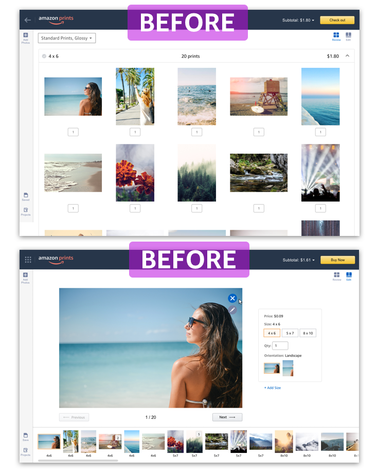
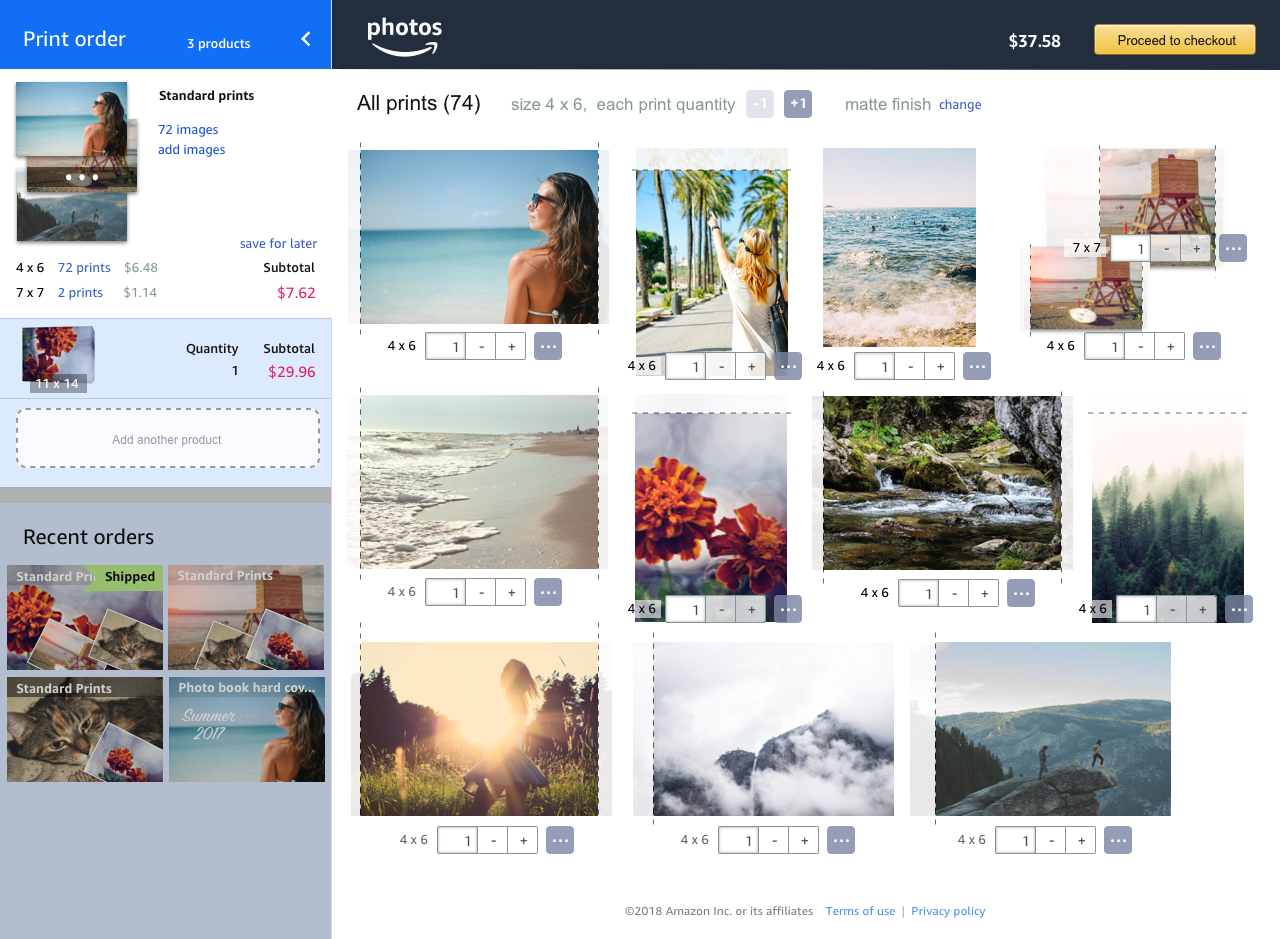
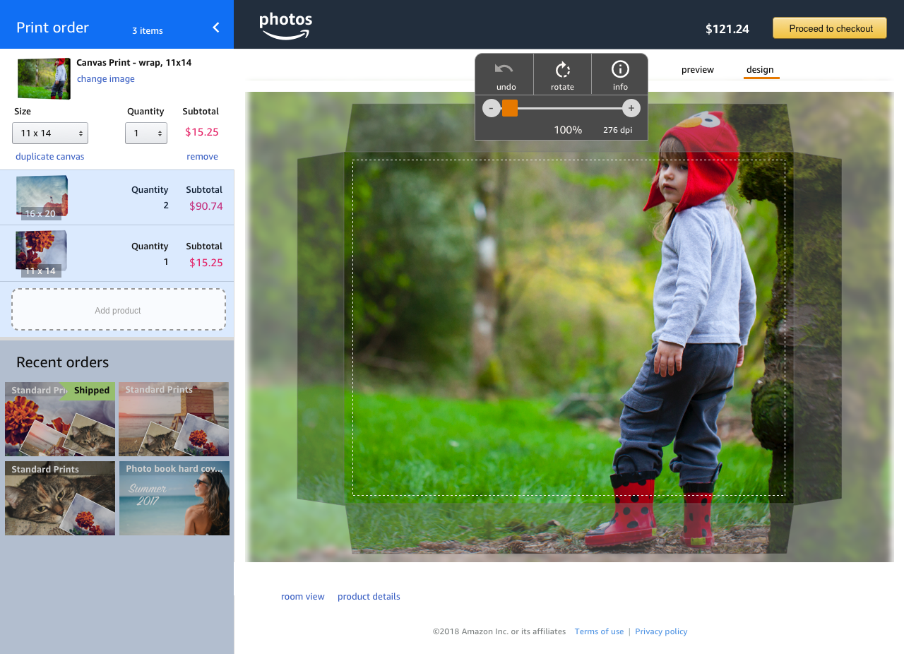
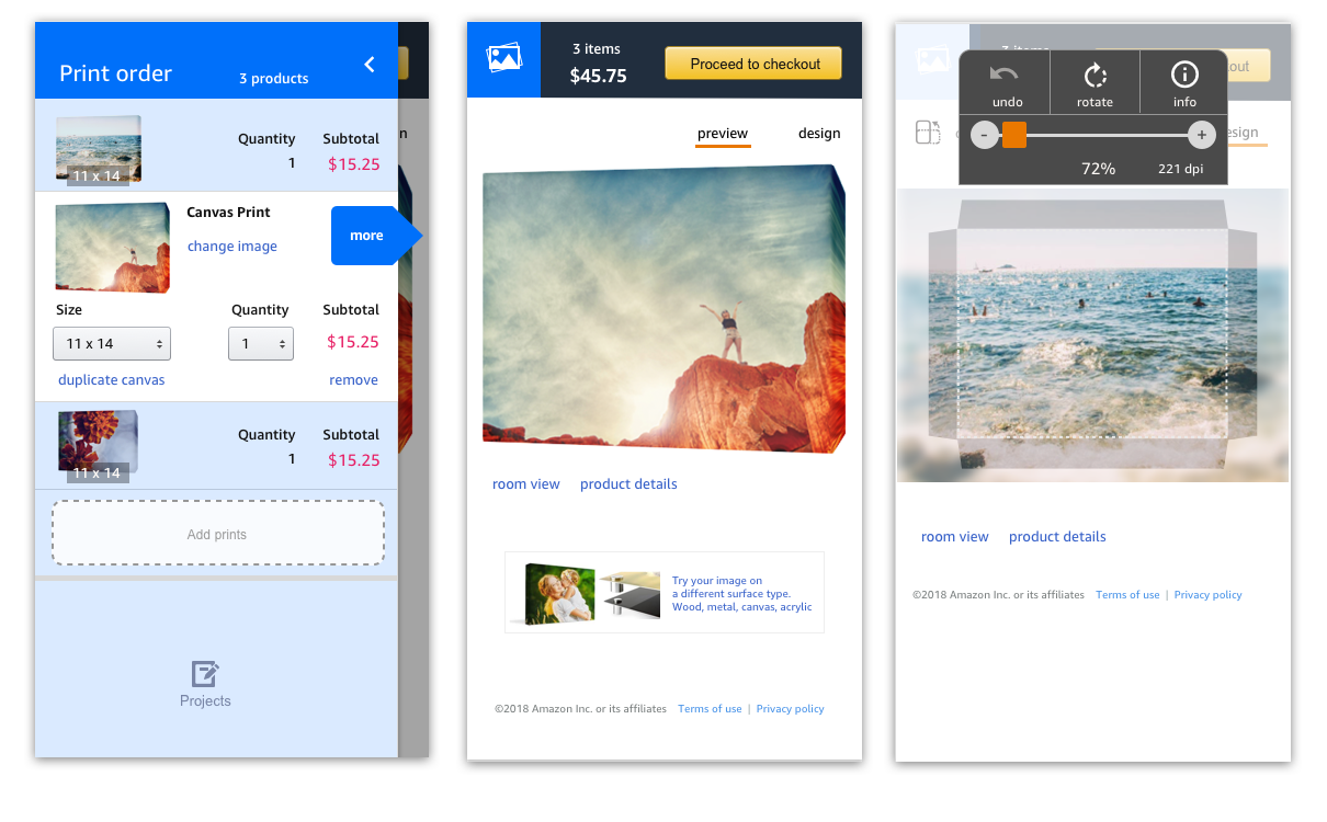
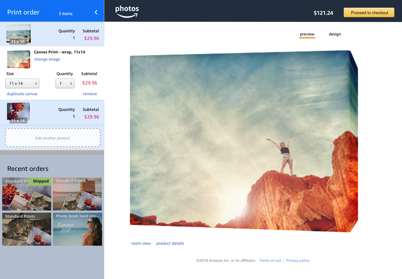
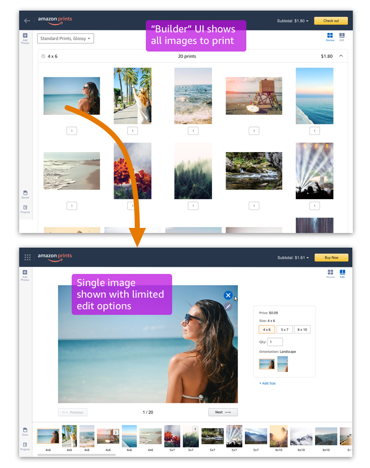
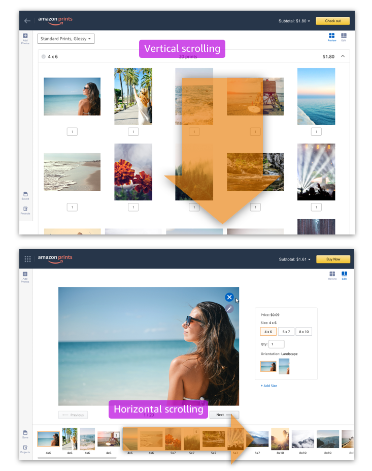
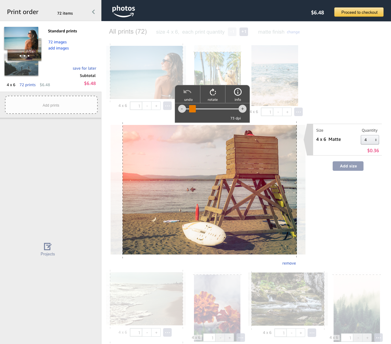
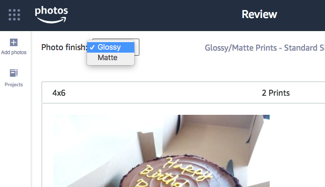
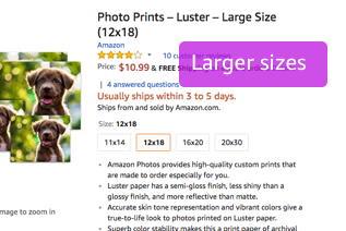
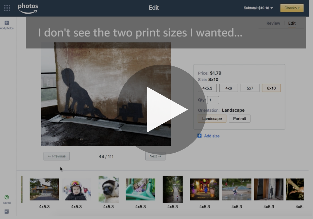
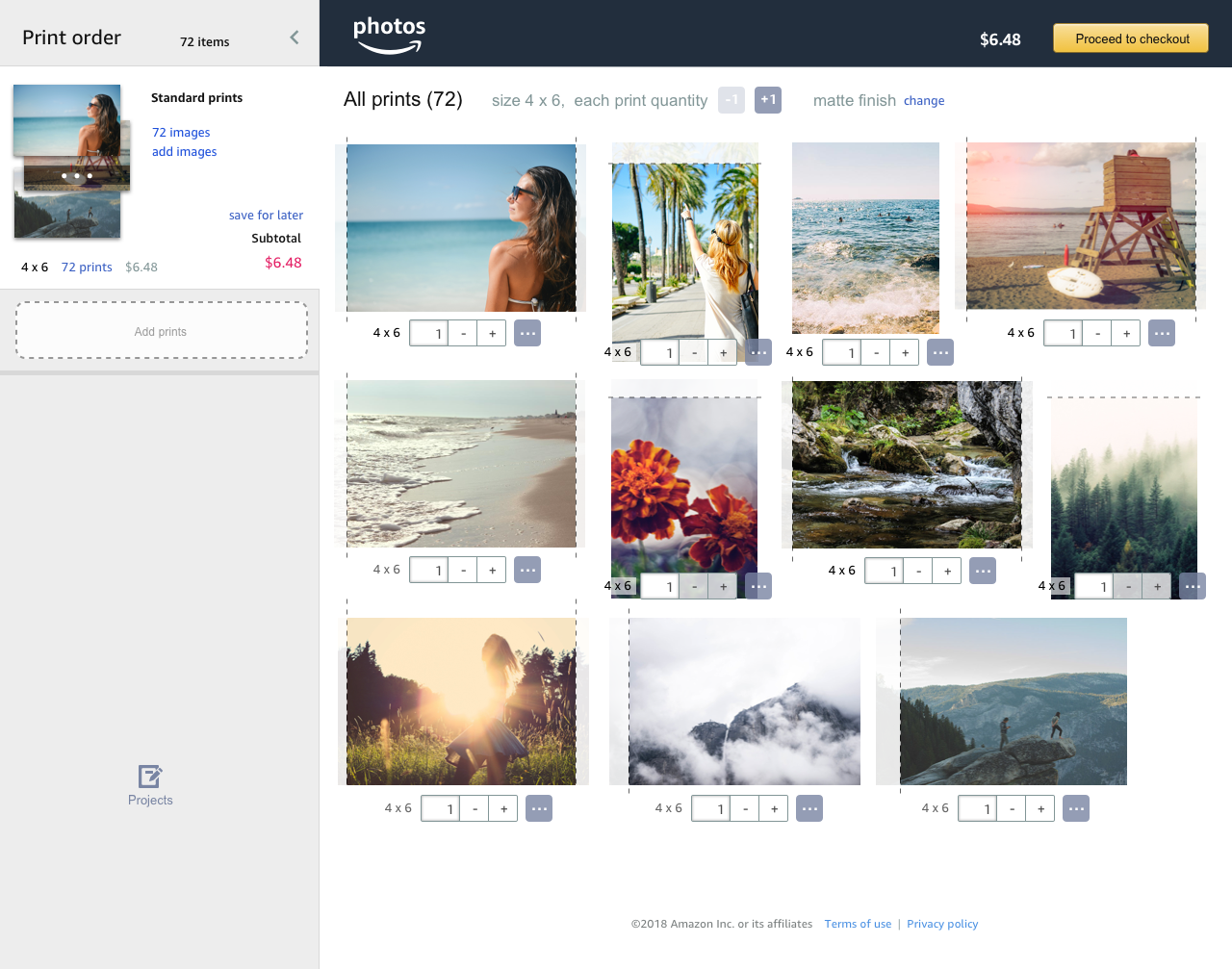
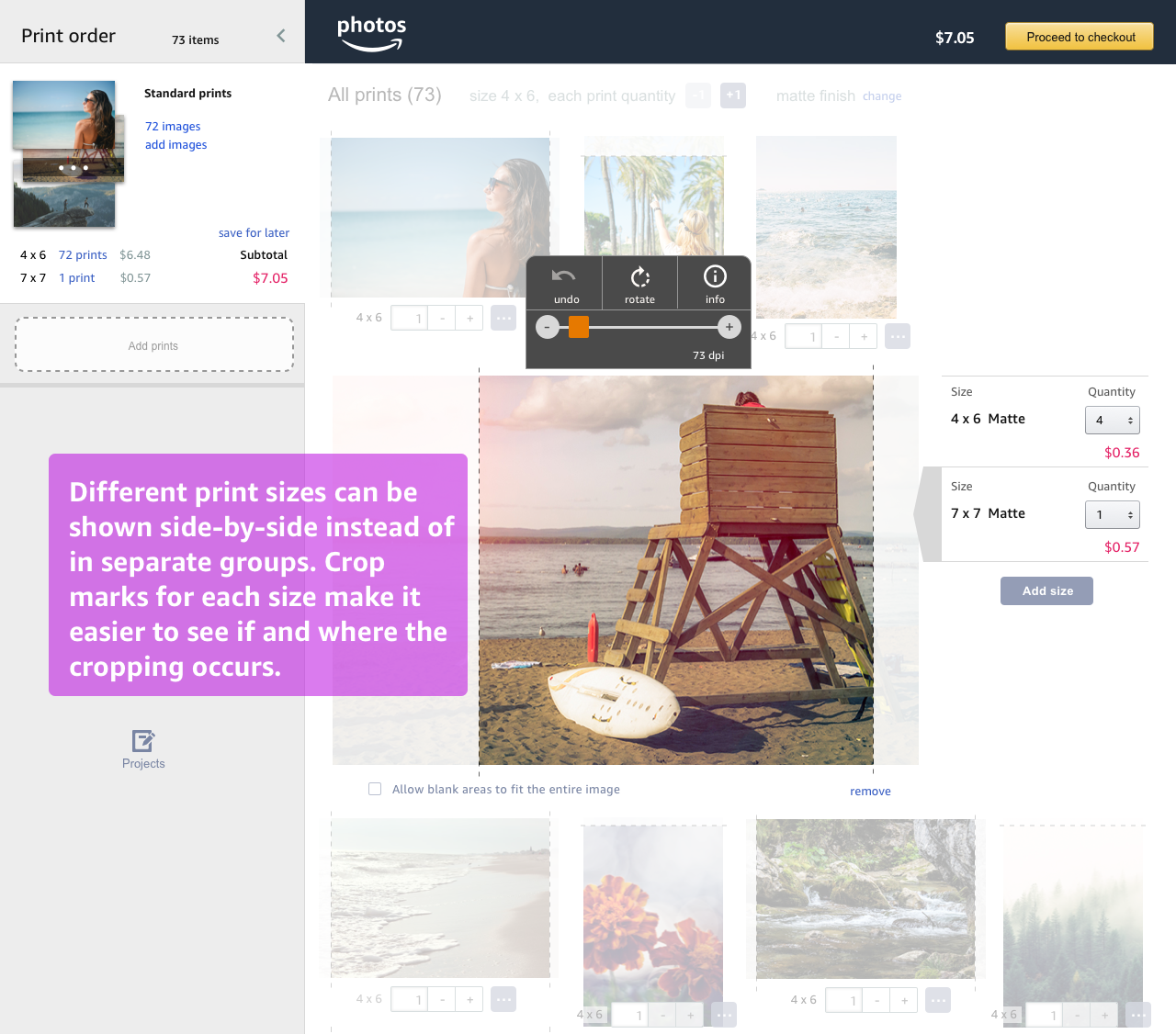
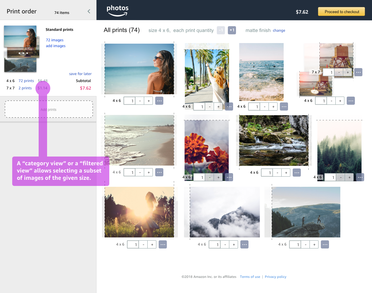
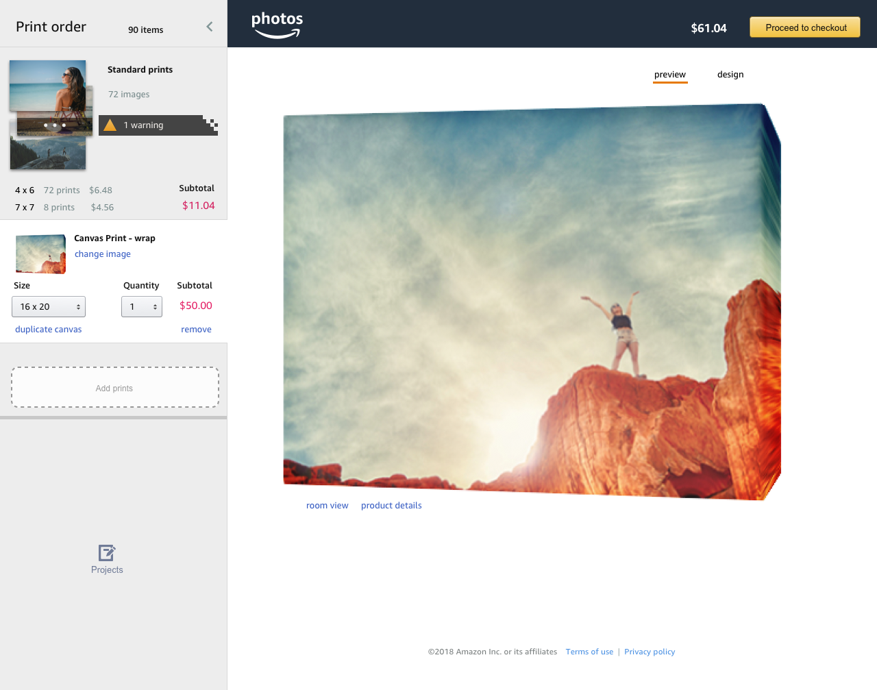
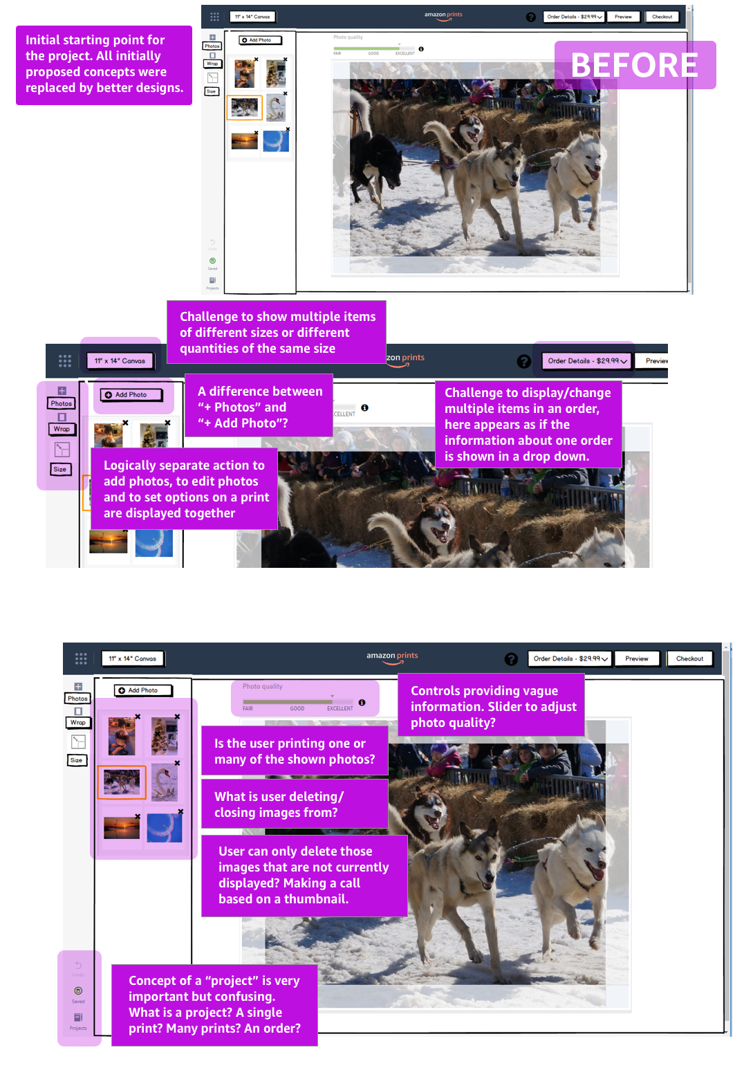
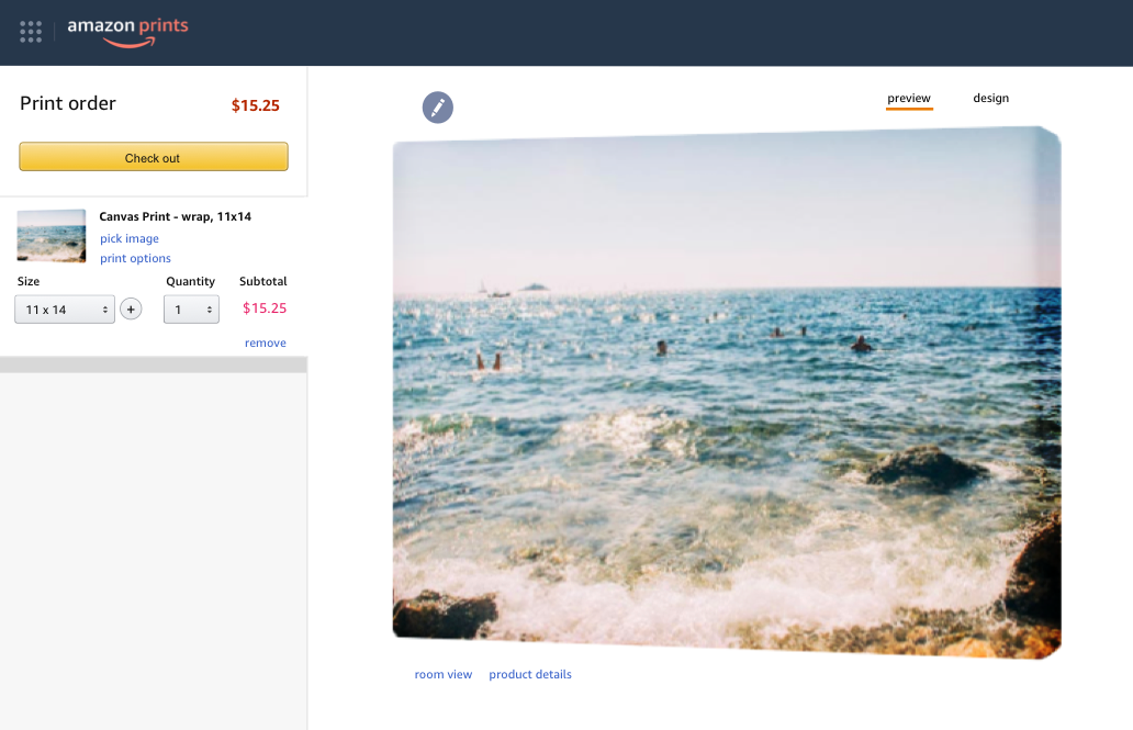
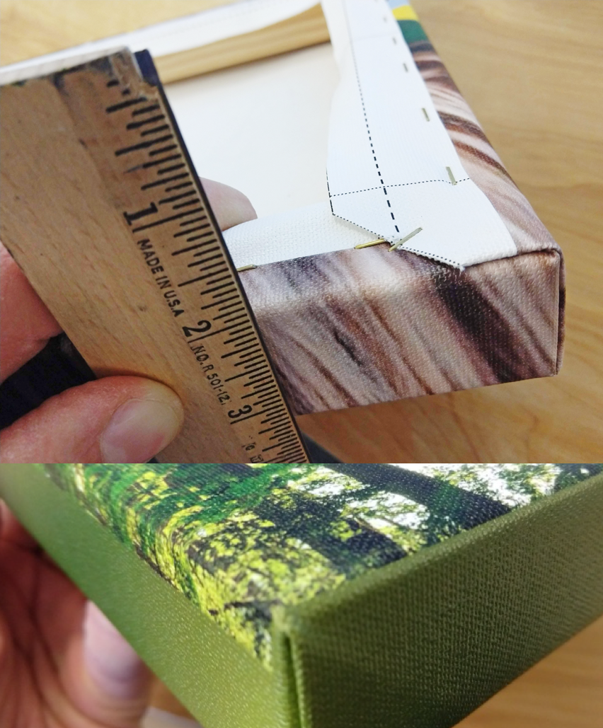
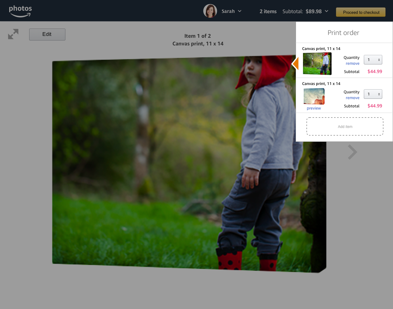
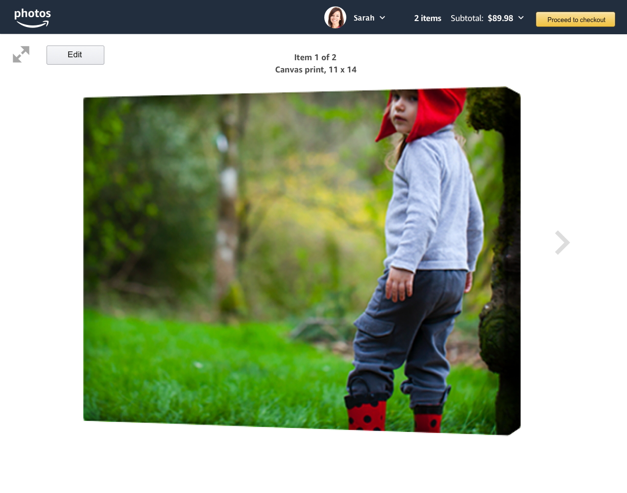
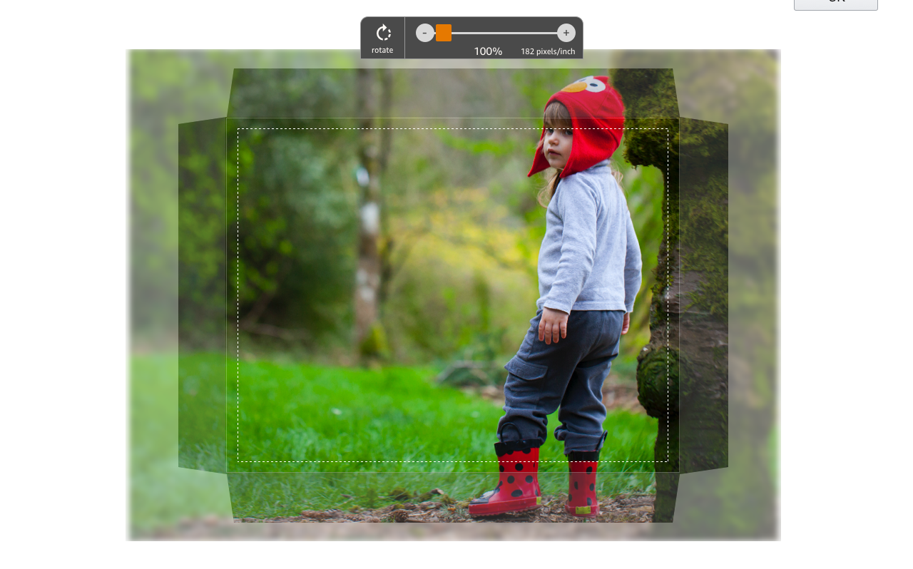
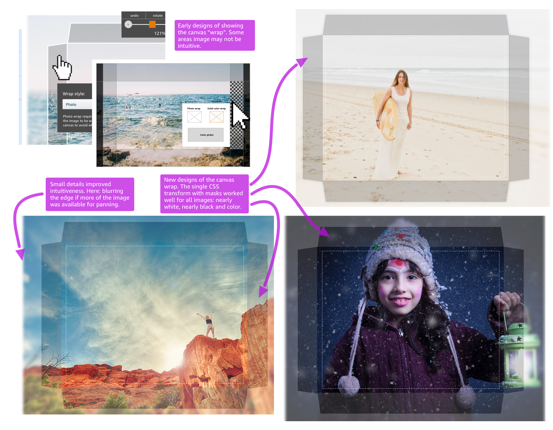
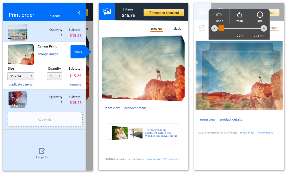
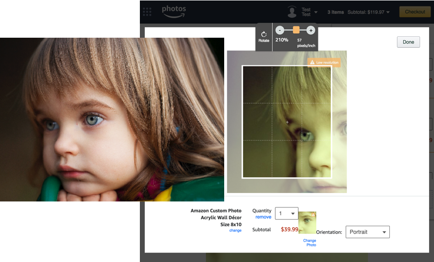
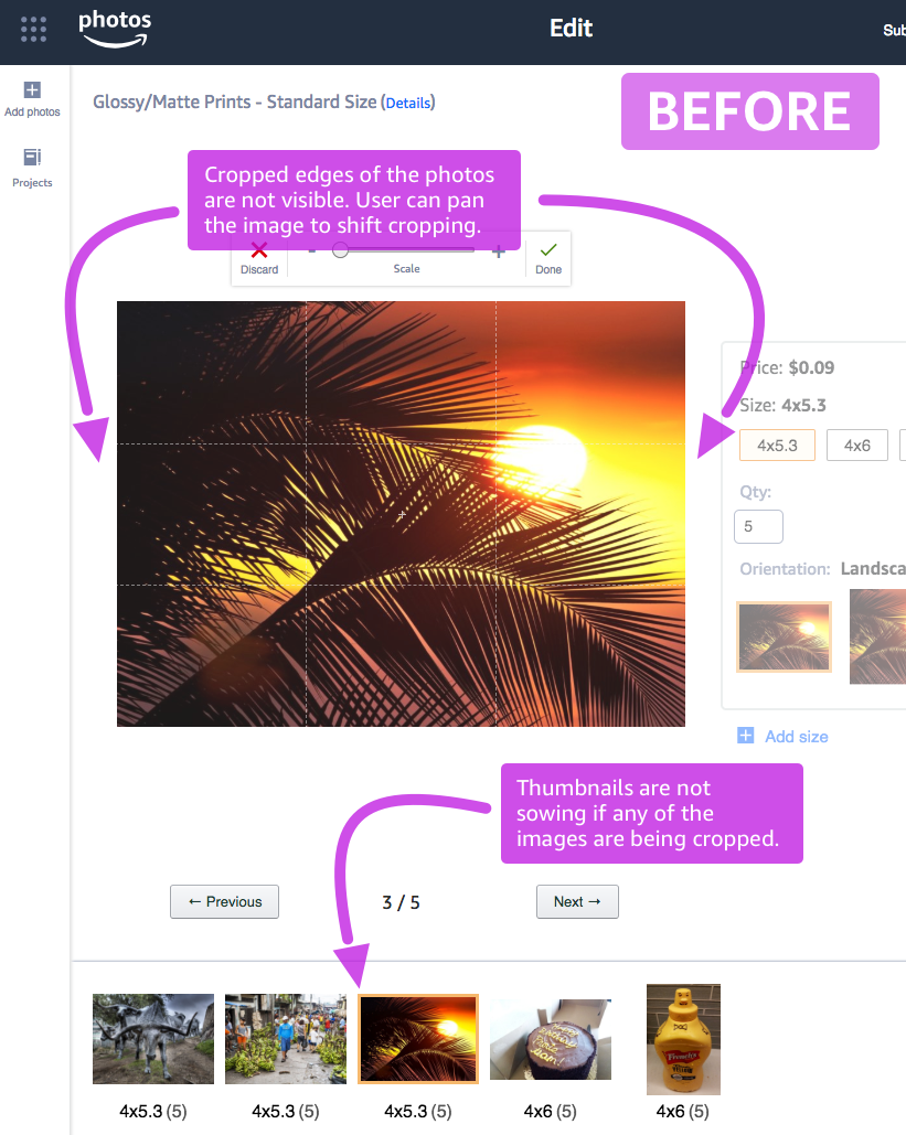
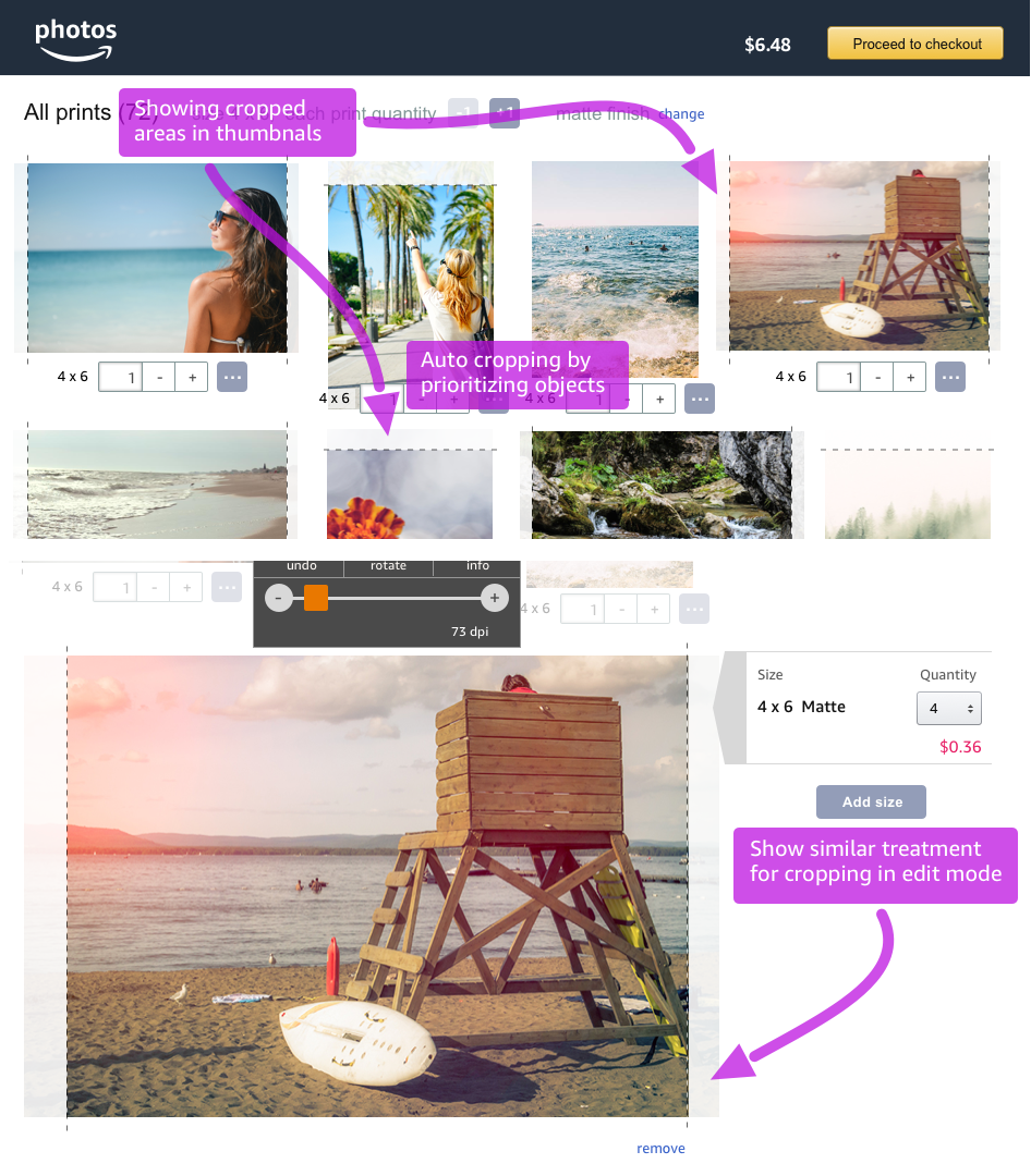
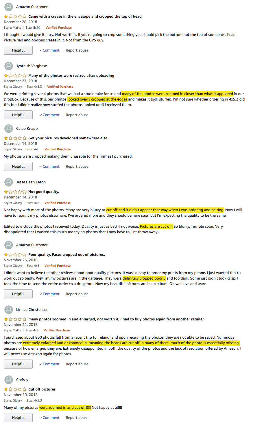
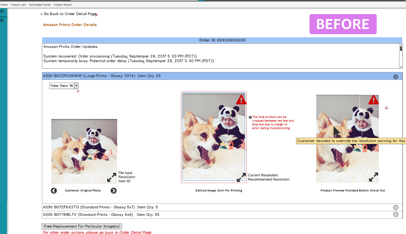
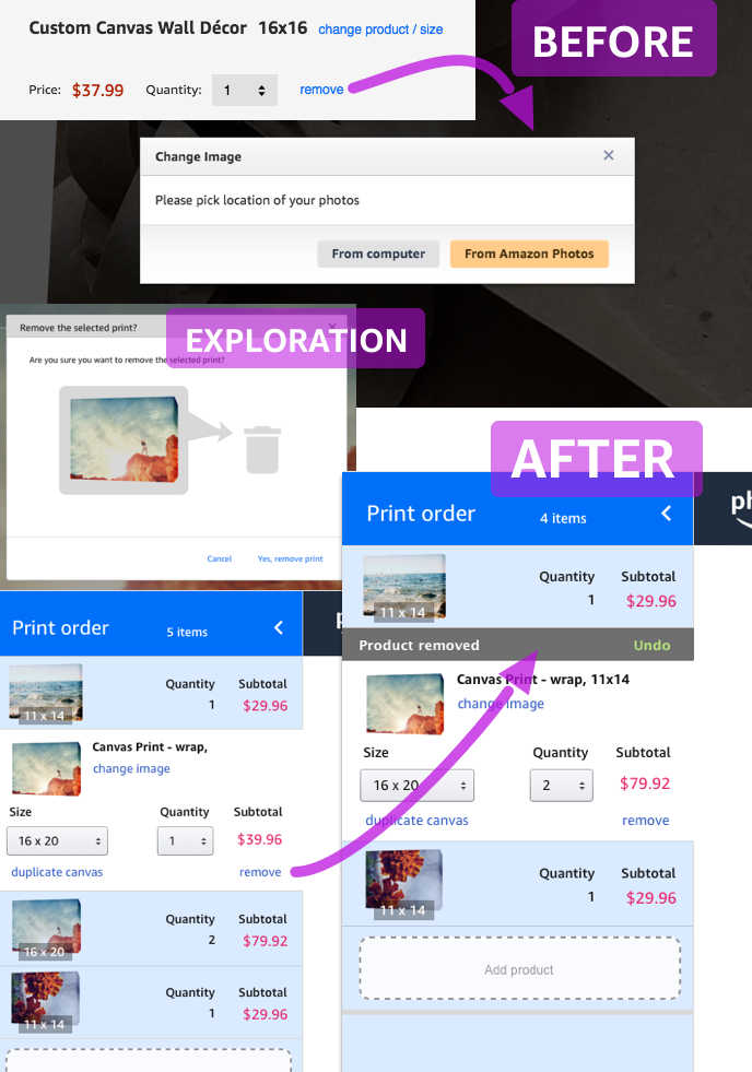
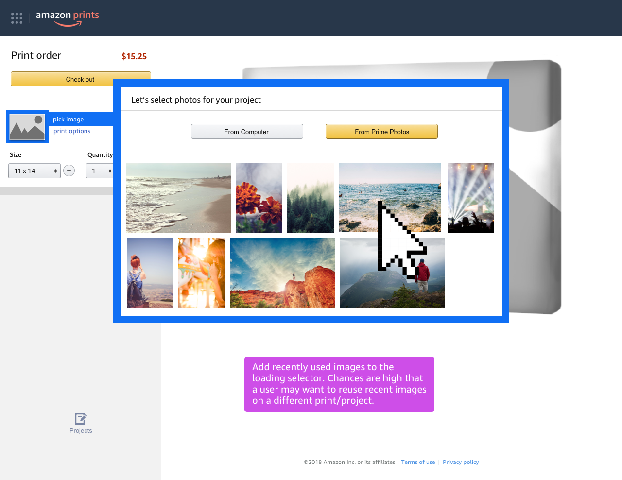
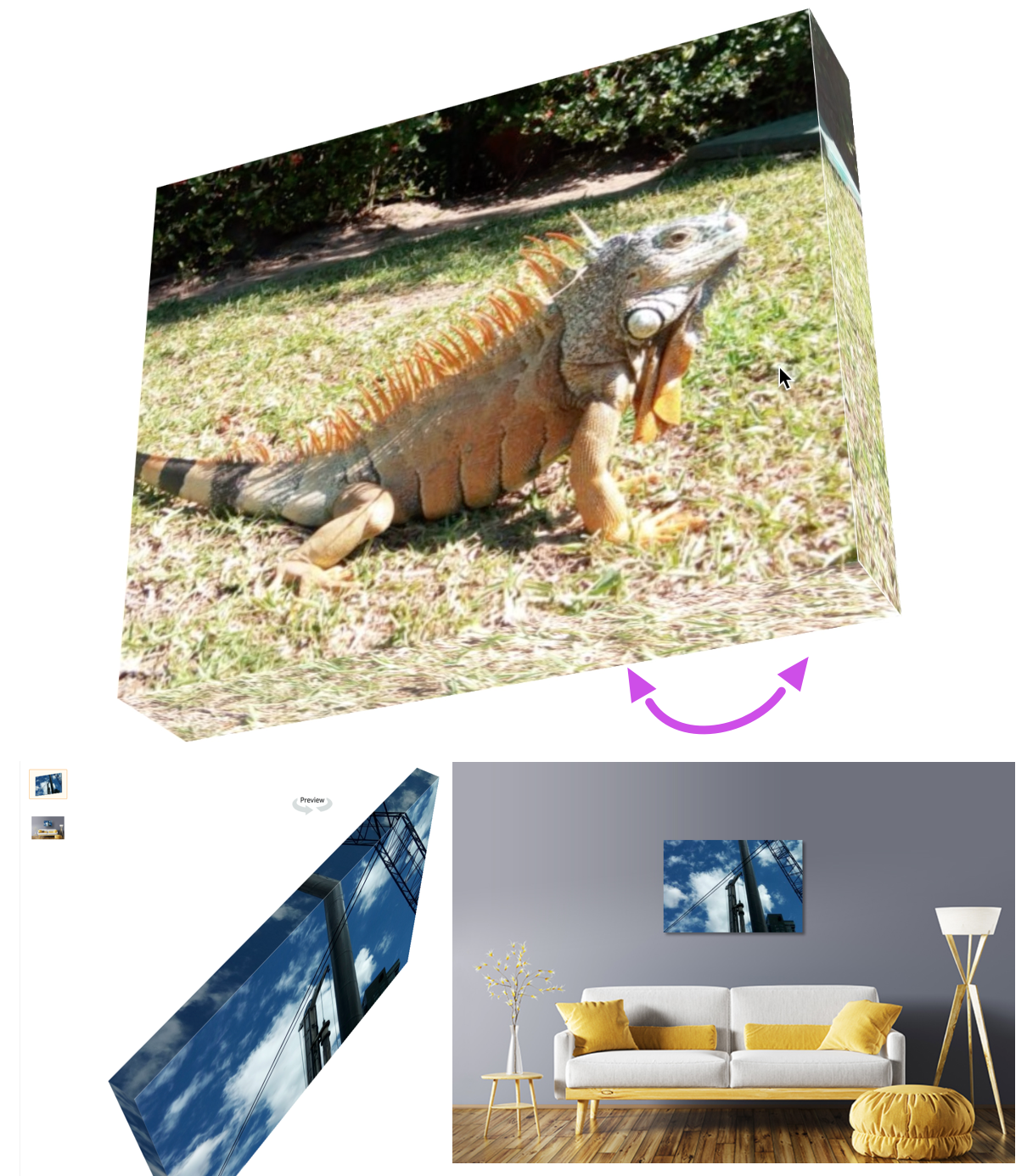
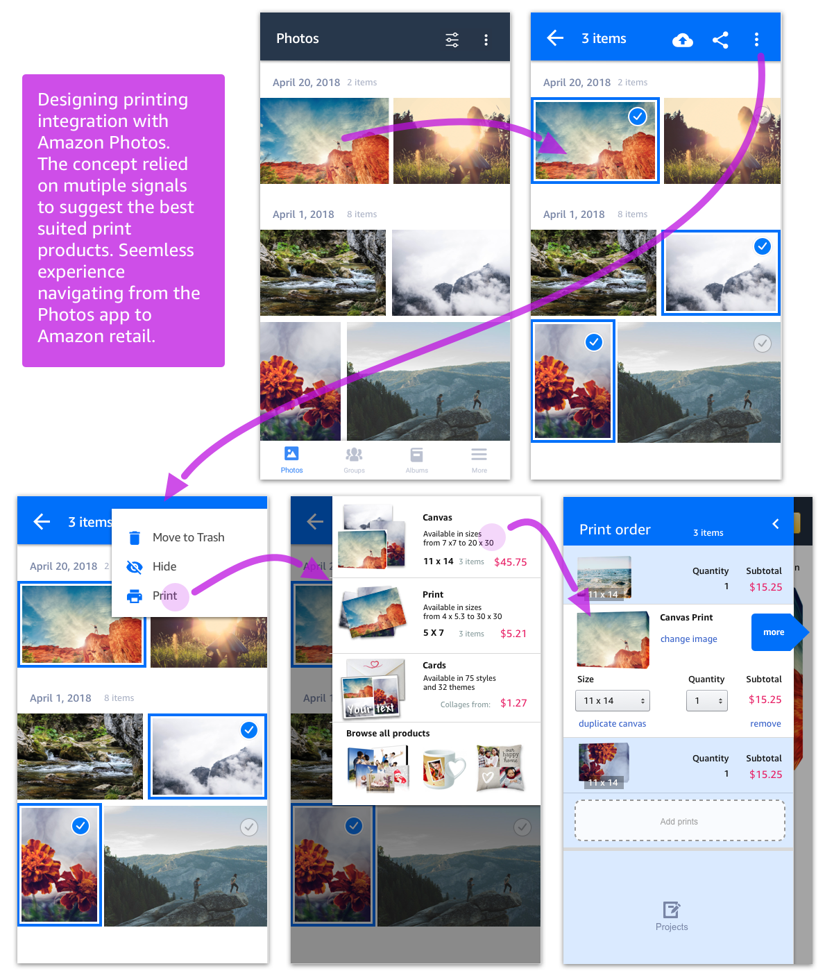
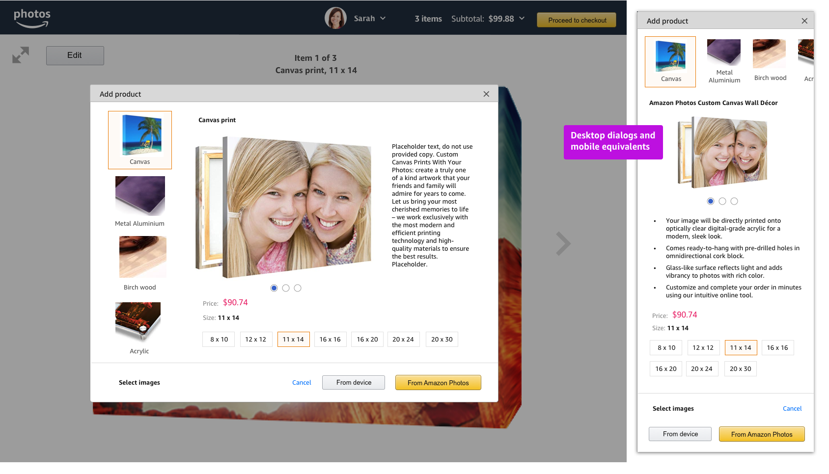
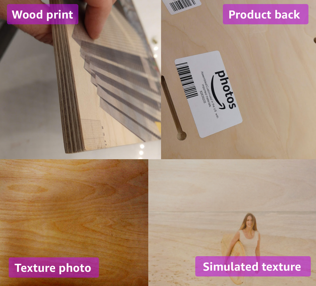
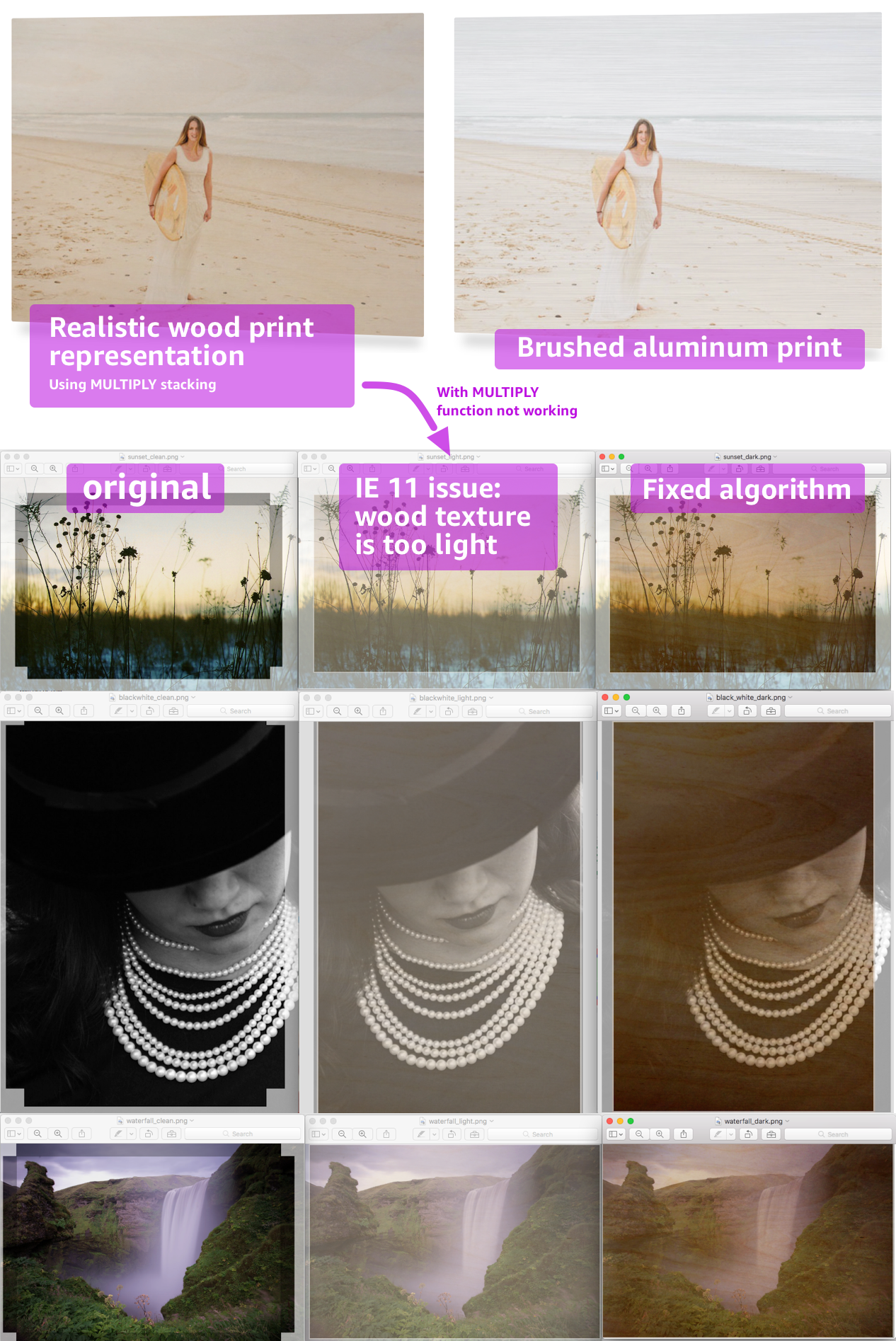
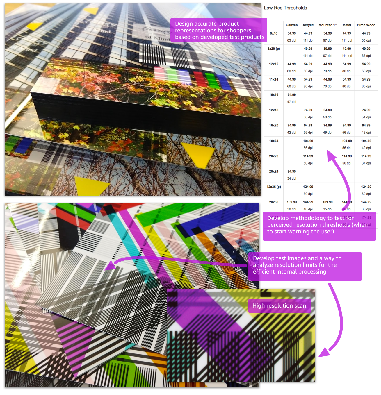
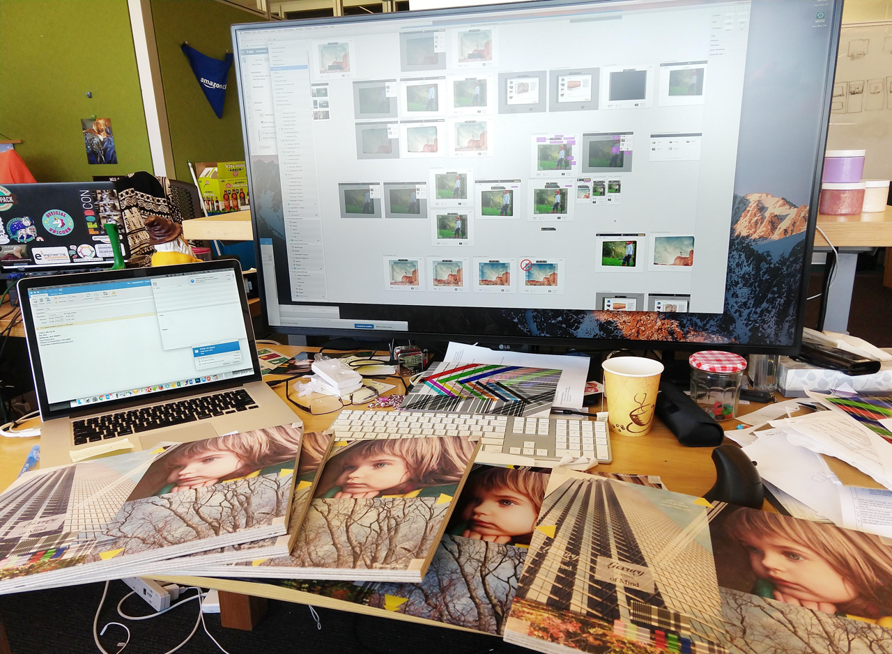
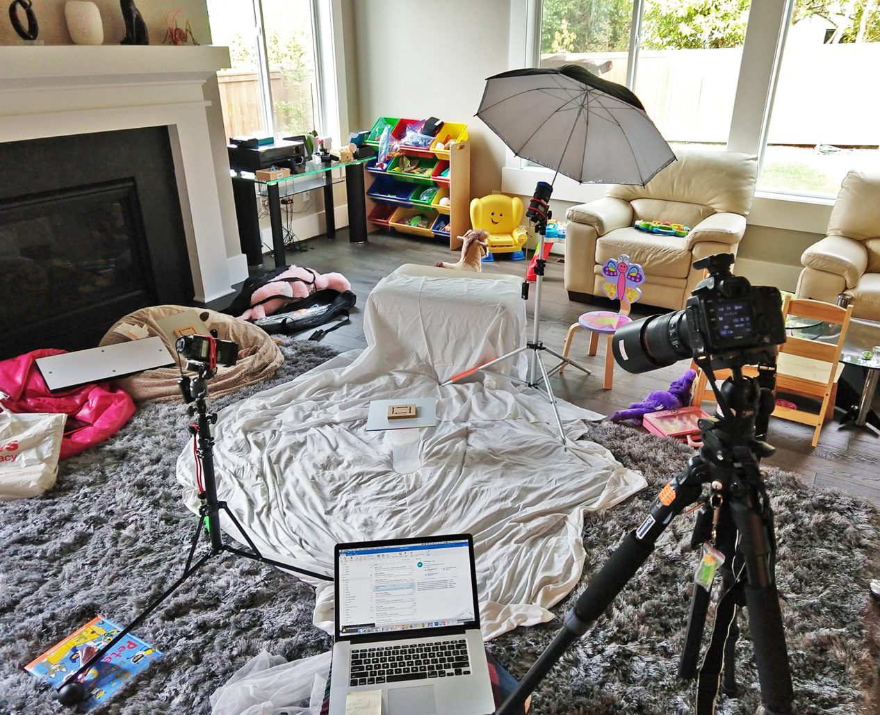
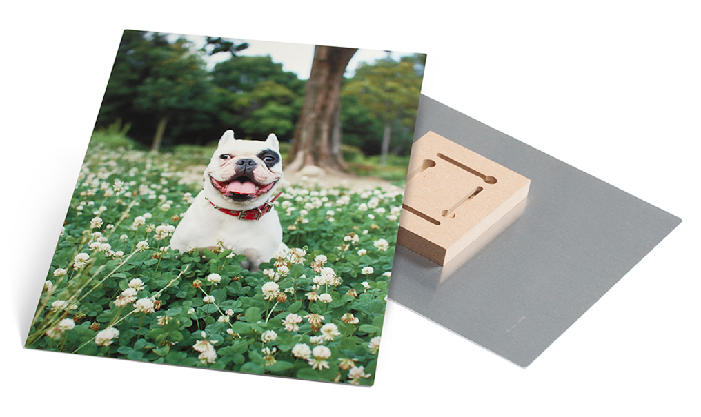
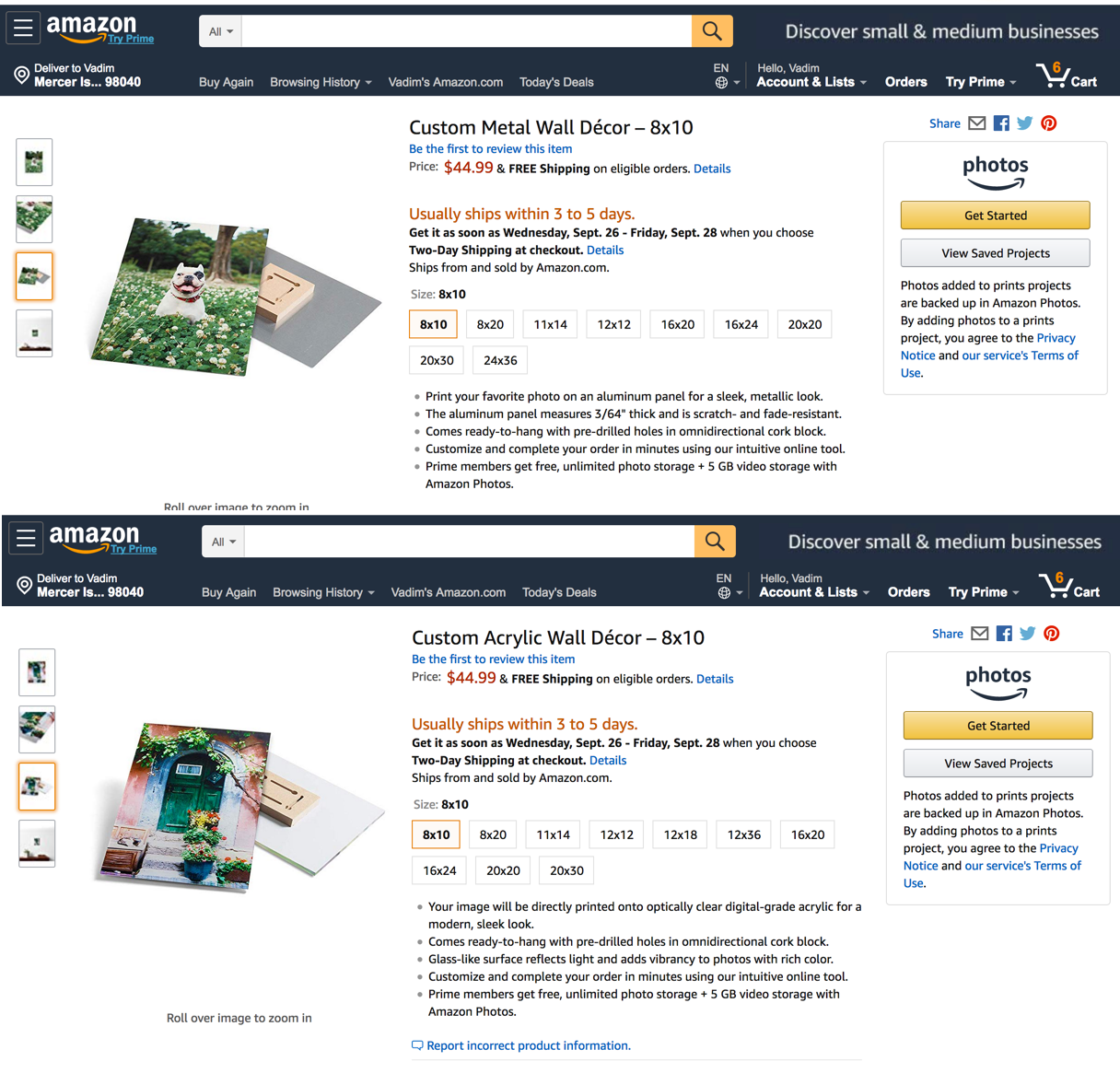
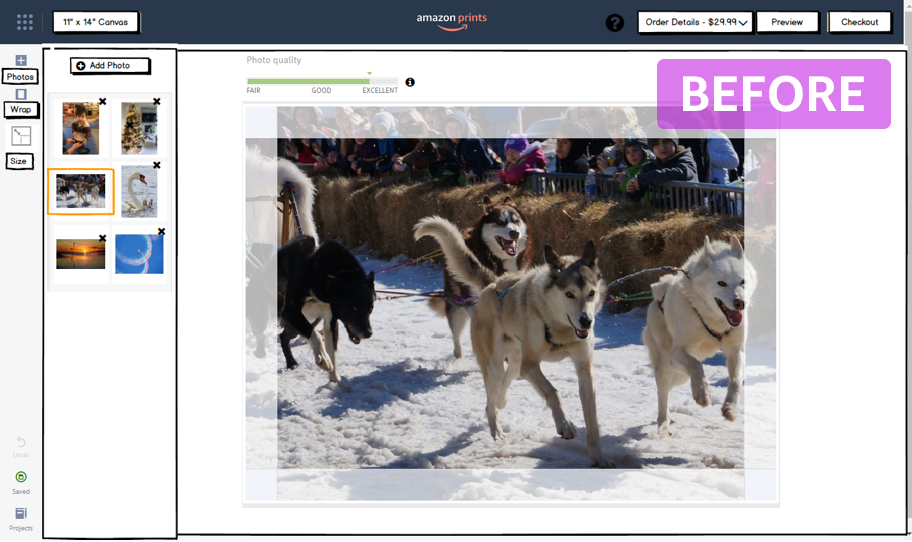
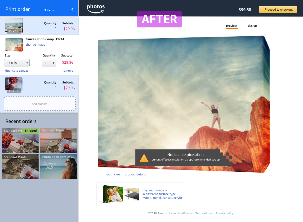
Amazon prints allows users to order regular paper photo prints or wall décor products (canvases, acrylic, wood, etc.) from within Amazon and have the products shipped to the customer. What seems like a simple problem of “just upload the images, pick the product and receive prints”, has many UX challenges, especially given the scale of Amazon. I joined the team to create the new user experience for intuitive ordering and editing wall décor products and in the process ended up redesigning most of the existing prints experience. Doing a good design is not simply enabling the functionality, but a combination of understanding the users and business and exercising a careful attention to details in crafting the details of the experience. Below are some examples of the details that went into the design.
When I joined the team, the work was underway to complete the development to enable users order paper prints. My design area was to create a new experience for ordering canvases and other wall décor products. Initially, the thought was to reuse the existing paper prints framework to order canvas items, but I realized that this would not work well. The paper prints are inexpensive and users order a large number of them at once. Wall décor products, on the other hand, are relatively expensive and users generally order only one or two, so the interface needs to be optimized for that experience. By developing a new way to order a wall décor products I also redesigned the framework of ordering paper prints and paving a way to add different types of products in the future resolving many of the existing deficiencies.
An idea of editing images in-place simplified earlier experience of changing the scrolling direction from vertical to horizontal. New designs had larger images, an easy way to change quantities without bringing up the keyboard (critical on mobile), clear crop marks and all prints were grouped by image, not by specific print size.
Canvas was one of the more complex surfaces for users to visualize. A new design first presented the users with the rendering of the final product and only then taking them to an optional editor. The details of how editing worked had to satisfy all possible cases of showing near-white images, near-black ones and all possible colors.
As an initial exercise, I examined the existing experience and made notes of what I thought might be an issue to a user and what improvements could be made. This page displayed a list of photo projects that users have started so they can go back to them in case they want to continue. It was deemed necessary to have this page but users rarely connected a concept of placing some prints in a cart with the project that gets created in a background.
Designers often can focus on one isolated piece of design, but here I wanted to first get a good feel for the architecture before starting making the tweaks. As it turned out, higher level approach made it possible to create the designs completely removing the need for this projects page, but to get to that point, a focus on the details was essential.
One issue with the previous designs was that all “projects” looked the same: a project with a single 4x6 print and another with a hundred of prints would appear exactly the same in the list. Displaying a tiny icon for the uploaded customer images was not connecting users with their images. An exploration here was to give more prominence to the images and display some key information as price and the quantity of images, and the type of the project.
Another iteration on presenting a concept of a project to a user. While this gives more space to user images, I still felt we can do better.
To improve the experience even further, a more detailed analysis was needed. And that meant asking a difficult quesiton what eact value this page brings and how are we nudging the desired user behavior.
Let’s consider a way how a user would navigate to a page that lists all projects. A user would need to know to click an icon at the bottom left corner. At this point, it's not evident what the destination page would contain. Importantly, if a user is in the image editing flow, the possibility of leaving the editing flow and not finding a way back is real. Why would we want users to navigate to previous projects and not completing the current one? What user benefit would that be?
The second way to access the project page was to click on the view saved projects button from the detail page. Here we are facing a familiarity issue, no other Amazon page displays a concept of a “project” next to a “Buy” button. Theoretically we could organize user purchases into “my winter boots project” or “dental care project” but it’s not something that we do or would benefit the users. Not having that familiarity users would miss this Projects button.
Consider another case where the user would potentially want to find a previous project. If a user is trying to make an order and that page suddenly closes, a user may start by navigating to Amazon home page and locating the project there. But the project in progress is not available in “recent orders” or “save for later” something that users would try. Instead, they would need to find the exact product page using the search and locate the projects button there. This is not obvious. Now let’s consider a more fundamental approach to improving a concept of print projects.
Consider how a user sees a photo "Project" depending on how long ago the images were added to be printed. If the user picks 20 images to print and doesn't proceed with printing and then 5 minutes later adds another batch of 50 images, the original 20 images may seem like a separate "project". However, if a month has passed, the distinction between the first batch of 20 images and the second of 50 becomes blurry. This insight can guide us to a new design.
What we discovered was that users did not navigate to the "abandoned projects" and the distinction between each project was blurry. To fundamentally improve the experience we can replace the concept of a project of “something that user has started” with “items the user may want to add to the order”. This gives us a flexibility of consolidating the unfinished items, deleting them if we detect user is not interested in reordering, surfacing some items from the past orders that may resonate with the user. Importantly, we need a way to connect the previous interesting items with the current order presenting them in a way where a user would not fear leaving the page and not being able to come back. Here’s such a design.
Original design had a page filled with photo thumbnails that scrolled vertically. Once a user clicked on an image, the scroll pattern would change from vertical to horizontal. While this seems like a small detail, users felt disoriented and could not easily locate the same image by scrolling horizontally while it was easily discoverable earlier.
Instead of switching the scrolling pattern, a better approach was designed with editing images in place. This way the same scrolling pattern would remain and users would not need to leave the existing screen. Any spacial memory about other images would remain once the user edits the image.
Interestingly, the existing design only allowed ordering either all photos in Glossy finish or all in Matte. The finish selector was placed on top of the page affecting all print sizes. Inquiring what was the rationale for such a design, I discovered that it was driven by the fact that printers that print matte prints were located in one part of the warehouse and those for glossy in the other. To avoid any mixup, a user is allowed to create an order for one part of the warehouse... I have often seen the organizational structure influence the design of the product, but have not seen the layout of the warehouse affecting the UX. This had to change. Besides nothing prevents us from splitting any order into multiple ones automatically.
One of the insightful discoveries from the previously conducted research was that users often think in terms of the specific image, not the specific print product. That is, it's more common to think "I have a great photo and it may look great printed large" rather than "I have this specific canvas type, let me find some image to print".
There a large number of print sizes that can be printed from 4x5.3 inches to 20x30. But instead of giving users a choice of size, in the original design two arbitrary groups were created: "Standard prints" and "Large prints". Once the user was in the path of printing a standard size, there was no way to order anything larger than 8x10, even though 11x14 is not that significantly larger.
A new framework was designed to address the observed issues in the existing design. Instead of having grouping the images by sizes (4x6 images would be separated from 8x10), the image would take prominence. This way it would be obvious to the user that one image is ordered in a one size AND in the other size, something not possible before. In addition, a simple filtering is added to the image order that allows filtering images by specific print size, if needed. Adding additional prints is also made more intuitive by having an “Add prints” button next to the order items list.
Showing an intuitive UI often creates an impression that obvious designs are easy and trivializes the work that goes into understanding the user, the problem, and the design. Here’s an example of the early experience that the team was set on delivering for ordering wall décor products. The small images on the left side represent the “staging area” the images that will not be ordered. The initial user experience would first navigate into the canvas editing and then optionally show the preview.
The initial user experience would first navigate into the canvas editing and then optionally show the preview. The redesigns removed the need to have a staging area and instead of first showing the editing screen first, presented the final rendering product. This would allow users to better experience the product and better understand the relationship between the final product and the edits.
As the pixellation effect becomes more severe, so does the warning level. Initially the warning threshold was thought to be in a binary state: the image either being in a good state or in a bad state. In reality, the pixellation slowly becomes more noticeable as the resolution decreases.
A photo canvas is stretched over a wooden frame and the editor needs to account for the frame thickness. A simple way is to have the front of the image and the four sides shown separately. To get a good understanding of the product, I explored many of our physical products. What was not immediately obvious, is the overprint of the image that goes on the back of the frame (the bleed area). The design had to account for that. Note how the original image crops in the preview.
Most users have curiosity to explore the application the first time they see it. Dragging is such a common pattern that I noticed nearly everyone clicked on the preview image and started dragging it as the first action before even reading what else is on the screen. We had to communicate to the users the overprint area (bleed area) that needs to be present but it prevents the image from being dragged all the way to the edge. Instead of permanently showing a message or describing in help in hopes that users somehow find it, a better solution was designed that would show the relevant explanation when the user tries to drag the image past the edge. Not only it solved the problem in the intuitive way, but also kept the UI free of superfluous text.
It is relatively easy to design a photo treatment that intuitively highlights an edge for a specific type of images. For example, for a dark image, it is possible to brighten the edge to show a different area. The challenge comes when the same type of algorithmic treatment needs to support nearly white images. In that case, whitening the bright portion of the image will make it indistinguishable from the rest of the image and from the background. I designed a way to show several areas (image, safety area, flaps and non-visible bleed) that would work reasonably well for nearly all images. Here are examples of how it works on nearly white, nearly black and on colorful images. The same algorithm is applied. Our user studies showed that users had no problem identifying the specific areas and intuitively understanding the meaning.
Designing an intuitive UX is a part of a larger solution. For a great experience, we also need to deliver high quality prints. I have some experience in professional photography and since some our target users were professional photographers we wanted to make sure we address their needs. Here I created some test images and discovered that having an embedded color profile would negatively affect the image. Specifically, the way the internals worked, the embedded color profile would simply be removed by the processing pipeline. Notice the significant shift in colors.
A few people pay attention to different aspect ratios of prints. In practice that means that uploading an image of one image size and printing it on another will cause some sides to be trimmed. The existing product to print paper prints correctly showed the resulted printed image, but it didn’t actively notify the users how much of the image is being cropped if the aspect ratios do not match. As part of my initial evaluation of the existing UI, I flagged this as a potential issue and designed a solution that would address the hypothetical issue. With the busy development schedule and having no customer complains at the beta testing, the solution was put on a back burner. Once the paper print product was launched and the reviews started coming in, we realized that not having an intuitive cropping was affecting the product rating. We started getting on average one-star review per week that was caused by the non-intuitive cropping. Fortunately, I had a hunch about the potential issue and made the designs in advance.
Designing an intuitive UX is only have a problem. For a great experience, we also need to deliver high quality prints. I have some experience in professional photography and since some our target users were professional photographers we wanted to make sure we address their needs. Here I created some test images and discovered that having an embedded color profile would negatively affect the image. Specifically, the way the internals worked, the embedded color profile would simply be removed by the processing pipeline. Notice the significant shift in colors.
There are some well-established UI patterns that are rarely given a second thought. One of them is showing a confirmation upon user doing some potentially dangerous action, as deleting an image. A confirmation dialog would pop up questioning “Are you sure?”. This seems simple. But such minor interruptions often negatively affect the perception of the application. What if the user wants to delete one image and then another and, after reviewing another? This interruption becomes annoying? It is often hard to make it intuitive. Here I initially explored a way to present such a question in a more meaningful way as showing the actual image that is being deleted and some rendering of a trash can. I then developed an way to use the UNDO concept instead of a box. It has multiple advantages: the system seems more responsive, the effect of deleting an image is instantly shown and the application is more forgiving by allowing the user to UNDO the last action. Despite the general complexity of implementing a full undo stack, this design could fake the delete by deferring the actual delete action.
When the user starts going through the process of printing images, one of the first question we ask is the location of the images. It was initially designed as a choice of two options. Observing the user I realized that often times the users are trying to load most recently used image or they try one printed product and want to explore another product and see how the same image may fit on another surface. In such cases accessing recently used images would speed up the selection. The designs accounted for such an insight and presented recent images along with the existing selection options.
I wanted to show how certain canvas images look from all the sides and the designed experience was to allow for canvas rotation. Several image libraries allow for rotation, but it took some care to get the right perspective. Another preview option was to show the properly scaled image in a living room setting to allow users better understand the size of the print.
There are printed products that print directly on wood creating a rustic feel as the wood grain show through, especially in lighter areas. We wanted to highlight the unique details of this product and I designed a realistic wood simulation. To achieve that effect I took a photo of a wood texture from the back of an existing print. For a quick exploration, I started with an wood texture image I took with my phone thinking to have it done professionally. With some editing and resizing however, the image turned out to be high enough quality for production. The was one technical challenge in the process. The required overlay blending was not working correctly in IE 11 browser and images were coming out as washed out. I redesigned the treatment algorithm to have a realistic wood texture avoiding the technical limitations.
Our marketing team handled the product photography, but as the luck had it, a day before the code lockdown we realized that some product images were missing. I took several products home where I set up a quick photo shoot, and within two hours I had the photos ready closely emulating the existing professional images. A bit of touchup and the product images were complete from my impromptu home studio and went live on the site.
JWe shipped the experience of ordering printed images from Amazon, something completely new to Amazon! As the case most designs, the initial redesign of one part of the system (wall décor) revealed deficiencies in the other (paper prints, handling of projects) cascading the changes to other part of the system. My designs addressed known difficulties that users experienced and correctly predicted some that were not obvious before the product had shipped.
It was also a year of learning and leading the design for a retail Amazon product and scaling the designs for Web, Mobile Web and Amazon Shopping App. There were many technology challenges and many rewards. Running and learning from the usability studies always makes me appreciate the deep insights that come from there.
This is also a new beginning. With many features and improvements that we wanted to implement but couldn’t do it in time, we have plenty of work ahead. Amazon entered a photo printing business and we all learned a lot. And now we have a better understanding of the process and users to make an even better future product!